 1:2 image by
Eugene Ipavec
1:2 image by
Eugene IpavecSource: Canadian City Flags, Raven 18

Last modified: 2018-07-04 by rob raeside
Keywords: wood buffalo | alberta | buffalo |
Links: FOTW homepage |
search |
disclaimer and copyright |
write us |
mirrors
 1:2 image by
Eugene Ipavec
Source: Canadian City Flags,
Raven 18
Municipalities in Wood Buffalo RM:
See also:
The Regional Municipality of Wood Buffalo encompasses the communities
of Fort McMurray (population 64,441) as well as ten smaller towns:
Anzac, Conklin, Draper, Fort Chipewyan, Fort Fitzgerald, Fort MacKay,
Gregoire Lake Estates, Janvier, Mariana Lake and Saprae Creek Estates.
Darrell Neumann, 15 April 2008
Text and image(s) from Canadian City Flags, Raven 18 (2011), courtesy of the North American Vexillological Association, which retains copyright. Image(s) by permission of Eugene Ipavec.
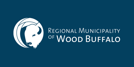
The flag of the Regional Municipality of Wood Buffalo has a
blue field bearing the region’s corporate signature in white. The corporate
signature has two components: the symbol and the word mark. The symbol,
at the left, is a disc enclosing a stylized wood buffalo head in white with
blue details to the right of four irregular arching sections in white edged in
blue, all nearly half the height of the flag. The beard of the buffalo extends
slightly beyond the border of the disc. To the right is Regional Municipality
above of Wood Buffalo extending nearly to the fly, in white sans-serif
letters; “Wood Buffalo” is in larger and bolder letters.
Alison Wilkes, Canadian City Flags,
Raven 18,
2011
Designed by a graphics firm.
Alison Wilkes, Canadian City Flags,
Raven 18,
2011
![[Rae-Edzo]](../images/c/ca-ab-woo.gif) 1:2 image by
Eugene Ipavec
1:2 image by
Eugene Ipavec
Source: Canadian City Flags,
Raven 18
The former flag was created after the ten communities of Wood Buffalo amalgamated in 1995. It is a Canadian pale design in blue-white-blue. In the centre is the municipality’s original corporate logo, a naturalistic head of a wood buffalo, in blue and white on a red field, within a blue ring. Three parallel lines emanate in each of the cardinal directions, the central line slightly longer. Around the outside of the top half of the ring is a band of blue and white with a geometric pattern.
As explained by the city:
The corporate symbol is made up of a roundel and linear bars representing a compass, pointing north, south, east, and west. This geographic reference had been chosen to symbolize the sheer size and scale of the municipality [the largest in Canada by area]. The style of the compass reflects the character of the First Nations art in order to identify the region’s original inhabitants. By its very power and presence, the bison (buffalo) presents an ideal symbol for a vibrant, strong community. It represents vigour and fortitude. By its gregarious nature, it also symbolizes community. By its history, it represents ideas of perseverance, endurance, and renewal. It stands for the individual’s independence as well as for the collected group, living together in mutual support and harmony. The semicircular form above the roundel represents the aurora borealis. This awe-inspiring phenomenon is a natural feature unique to northern regions. It has been chosen here to symbolize the unparalleled experience of life in the North. This abstract form is intended to appear umbrella-like, in this reference, to convey the sense that the aurora is a canopy enveloping the region and connecting together the people who live in this northern municipality.Alison Wilkes, Canadian City Flags, Raven 18, 2011
 image contributed by Darrell Neuman, 30 July 2013
These are pictures of the flags on display at the Wood Bison Viewpoint
located at Syncrude, Fort McMurray, Alberta. Here is a close-up image of the
wood bison flag, from a scene showing
several flags. I only saw this particular flag at the viewpoint, so I assume
that is the symbolism behind this design.
Darrell Neuman, 30 July
2013