![[Flag of Colombia]](../images/c/co.gif) (2:3)
(2:3)  image by Željko Heimer, 20 May 2001
Last modified: 2024-04-13 by daniel rentería
Keywords: education |
Links: FOTW homepage |
search |
disclaimer and copyright |
write us |
mirrors
![[Flag of Colombia]](../images/c/co.gif) (2:3)
(2:3)  image by Željko Heimer, 20 May 2001
See Also:
 image by Ivan Sache, 27
July 2019
In 1917, the first National Pedagogic Congress held in Colombia decided the
establishment in Bogotá of Instituto Pedagógico Nacional (IPN), where classes
started on 9 March 1927 under the guidance of the German educationalist
Francisca Radke. As a reaction against conservatism of IPN, Escuela Normal
Superior was established in 1936 to promote liberal education; the old masculine
and feminine faculties were merged in a modern, mixed system.
Escuela Normal
Superior was split back into faculties in 1952, while Francisca Radke
established in 1955 Universidad PedagĂłgica Nacional Femenina to foster the
incorporation of woman to the academic and economic circles of the country.
Universidad PedagĂłgica Nacional (UPN), established in 1962, was granted full
autonomy in 1968.
UPN is composed of 4 Faculties: Science and
Technologies, Education, Sports, and Humanities.
http://www.pedagogica.edu.co/
UPN website
The flag of UPN is horizontally divided blue-white with the
university's emblem in the center.
Photos
https://www.rcnradio.com/estilo-de-vida/educacion/fabio-martinez-perez-es-el-nuevo-rector-de-la-universidad-pedagogica
https://www.elnuevosiglo.com.co/articulos/07-2018-director-ipn
http://ocecolombia.co/pliego-de-exigencias-de-los-estudiantes-de-la-universidad-pedagogica-nacional/
Ivan Sache, 27 July 2019
Escuela de Enfermería
 image by Ivan Sache, 05 July 2011
The Infirmary School of the Pedagogical and Technological
University of Colombia (Escuela de Enfermería Universidad
Pedaógica y Tecnológica de Colombia).
Flag at the university
website. The device is an oil lamp.
Jan Mertens, 2 December 2008
Actually, the translation of the name of this institution
should read 'School of Nursing of the Educational and
Technological University of Colombia.
Ron Lahav, 4 December 2008
"Universidad Pedagógica y Tecnológica de Colombia" (UPTC) was founded in 1953
in Tunja (Boyacá Department); UPTC has today sections in Duitama, Sogamoso and
Chiquinquirá (Boyacá Department. UPTC is formed of the Faculties of Agronomical
Sciences, Basic Sciences, Education Sciences, Economical and Administrative
Sciences, Health Sciences, Law, and Engineering, and of three Secion Faculties
located in the secondary sections of the University.
The flag of UPTC, as shown graphically and described on the UPTC website, is
quartered black-ochre. Black represents decency, modesty, discretion, commitment
to the service and the defence of the sovereign homeland. It represents the
shyness of our citizens and the discretion of the women. Ochre recalls that the
Tunja lands, seemingly arid, bore the first wheat grain ever in Colombia. Ochre
also represents maize, the most important staple food of the Muisca culture, and
the sun that was venerated by our ancestors.
Source:
http://www.uptc.edu.co/universidad/acerca_de/index.html#BANDERA
The flag of the School of Nursing, designed by the student Olga Marina
Valero de Hernández, is white with two ochre and black horizontal
stripes on top and bottom, covering together 40% of the flag's hoist
and recalling the flag of UTPC, and the School's emblem in the middle.
Source:
http://www.uptc.edu.co/facultades/f_salud/pregrado/enfermeria/inf_adicional/simbolos/bandera.html
(new link but photo of the flag still there)
The emblem of the School of Nursing is an oil lamp as used in 1200 by
St. Catherine of Sienna [indeed the nurses' patron saint, but she
lived in 1347-1380, not in 1200] during the black plague epidemic; the
saint visited nightly sick people, using the lamp to find her way
through the town's streets. The oil lamp has been used since them when
watching over sick people in hospitals, convents, asylums and all
kinds of health institutes. Florence Nightingale (1820-1910), the
pioneer of modern nursing, used such a lamp during the Crimean War
(1853-1856) in her nightly rounds and was nicknamed "The Lady with the
Lamp". The oil lamp is a symbol of light, clarity, knowledge and hope.
Source:
http://www.uptc.edu.co/facultades/f_salud/pregrado/enfermeria/inf_adicional/simbolos/index.html
Ivan Sache, 05 July 2011
 image located by Paul Bassinson, 4
September 2023
Source: https://www.facebook.com/photo/?fbid=3060547770628296&set=a.3060547607294979
 image by Ivan Sache, 14 September 2014
Institución Educativa Pedro Estrada was established in the San Fernando
borough, part of the municipality of Itagüí (Antioquia Department), in 1954, and
registered in 1959 by Departmental Ordinance No. 21. The institute is named for
the Itagüí-born entrepreneur Pedro Estrada González (1881-1956).
Source:
http://www.iepedroestrada.net/ - Municipal website
The flag of the institute is horizontally divided blue-red with a white
triangle placed along the hoist and charged with the institute's emblem. Blue
represents the constant progress towards excellence, quality and humanization of
education. Red represents passion for a project of personal and institutional
life centered on the human being. White symbolizes the building and permanent
compromise of the educational community towards a culture of peace.
Source:
http://www.iepedroestrada.net/index.php/filosofia/simbolos-institucionales/bandera
- Institute' website
The emblem of the institute is circular. In the middle is placed a symbol
representing the human being and letter "I", for "Informática" (computer science),
"institución" (institution), and "formación integral" (integral education). The
symbol is surrounded by four people with open arms, who represent the
educational community. The emblem uses the institutional colours: white, red,
and blue. The emblem represents the humanist philosophy of the institute. In the
center of the educative process is the person, who receives and projects the
values of the educational community, composed of the students, parents, managing
teachers, teachers, and ex-alumni. Those are united by their open arms for team
work, as an evidence that the community learns, innovates, and participates.
Source:
http://www.iepedroestrada.net/index.php/filosofia/simbolos-institucionales/escudo
- Institute' website
Ivan Sache, 14 September 2014
 image by Ivan Sache, 10 September 2014
Institución Educativa Técnica Pedro José Sarmiento is located in Socha
(Boyacá Department).
The institute is named for General Pedro José Sarmiento, President of the
Sovereign State of Boyacá, killed on 17 June 1885 during the Battle of La
Humareda.
The flag of the institute is horizontally divided green-white-green.
Source:
http://www.socha-boyaca.gov.co/apc-aa-files/33383463363735336232333366366365/SIMBOLOS_DE_LA_INSTITUCION_1.pdf
- Socha official website
Ivan Sache, 10 September 2014
 image by Ivan Sache, 10 January 2021
Escuela Normal Superior Pedro Justo BerrĂo, located in Santa Rosa de Osos (Antioquie),
is named for the local lawyer and politician Pedro Justo BerrĂo (1827-1875),
President (~ Governor) of the Sovereigns State of Antioquia from 1864 to 1873,
and, subsequently, Rector of the University of Antioquia. BerrĂo significantly
contributed to the development of Antioquia, promoting education and transport;
he is credited the establishment of hundreds of schools, of the Bank of
Antioquia and of the first railway in the state.
The flag of Escuela
Normal Superior Pedro Justo BerrĂo is horizontally divided white-red with the
school's coat of arms in the center.
White and red summarize the customs'
purity and juvenile ardor that reign in the school.
The shield's upper
half features the schematic representation of mountains and the sun, recalling
the Antioquia anthem, "Oh Liberty that perfumes the mountains of my
motherland... and I love the sun because it is free". This alludes to liberty,
tenacity and honesty.
The lower quarters, left, charged with a cross, and
right, charged with a lighthouse, refer to faith and science, respectively.
https://enspedrojustoberrio.edu.co/2018/03/15/simbolos-institucionales-2
School website
Ivan Sache, 10 January 2021
 image by Ivan Sache, 8 November 2010
Colegio Pensamiento, located in Cali, was started on 26 August 2005.
The flag of Colegio Pensamiento, as shown graphically on the
institute's website, is
divided white-light-blue-green along the ascending diagonal. The white triangle
covers half of the flag, while the blue and green stripes are of equal height,
one half of the flag's hoist. White represents the human being as a person and
his/her required transparency. Light blue represents the greatness and immensity
of heavens, as well as the importance of education in the institute. Green
represents the natural environment and the contrast experienced by the human
being facing the world.
Ivan Sache, 8 November 2010
 image by Ivan Sache, 01 July 2014
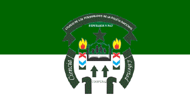
The flag of the institute is horizontally divided green-white with the
institute's emblem in the middle. The colours are those of the flag of the
Colombian Police. Green represents hope and force, while white represents
energy, purity and peace.
Source:
http://coopepaz.blogspot.fr/2013/09/escudo-coopepaz.html
The emblem of the institute features two arrows pointing upwards, as a
symbol of cooperatives, an open book, as a symbol of knowledge, the torches of
science and liberty, and a star representing the "police civic emphasis".
Source:
http://coopepaz.blogspot.fr/2013/09/escudo-coopepaz_2.html
Ivan Sache, 01 July 2014
 image by Ivan Sache, 10 January 2021
Jardin Infantil Campestre Pequeños Exploradores is located in Medellín
(Antioquia).
The flag of Jardin Infantil Campestre Pequeños Exploradores
is horizontally divided white-red.
Photos
https://www.facebook.com/114270808909259/posts/1117438645259132
Ivan Sache,
10 January 2021
 image by Ivan Sache, 20 March 2019
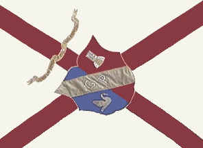
"Fundación Gimnasio Pereira" is a girls' institute
located at Pereira, Department of Risaralda.
The institute was founded on 11 February 1947 by Arturo Vallejo,
Manuel Mejia, Manuel Uribe and Pablo Ramirez. After the death of
the first Director of the institute, Carlota Sánchez Marín, on
26 August 1958, the institute was transformed into a foundation
to avoid an economical crisis. The patron of the institute is St.
Thérèse of the Child Jesus.
The flag of the institute
was adopted after a competition won by Beatriz Toro (student in
1947-1957). The flag is beige with a red saltire and the coat of
arms of the institute in the middle. On the photo of the flag,
the coat of arms is tilted to the upper left corner (so that its
vertical axis is parallel to the descending diagonal of the
flag). The flag is 1.06 m x 2.40 m, the width of the arms of the
saltire being 10 cm.
Beige represents force, vigor and hope, while red represents
unity and love.
The flag shall be equipped with red tassels.
The first flag was made by the "RR. MM. Adoratrices" (I
guess, religious) of the town of Pereira.
The coat of arms of the institute was created by Jorge Roa
Martínez. The shield is vertically divided blue (for the
feminine grace, elegance and seriousness) and red (for love,
solidarity and social democracy) and crossed by a yellow bend
(for the precious gift of science and knowledge) charged with the
black letters "G" and "P" (for "Gimnasio
Pereira").
A white swan placed in the lower part of the blue field
represents the feminine grace; a white tower masoned black placed
in the upper part of the red field represents virtue.
The shield is surmonted by a white scroll charged with the motto
(in Spanish) "POR LA GRACIA Y LA VIRTUD" (For Grace and
Virtue).
Source: Institute
website
Ivan Sache, 13 April 2009
 image by Ivan Sache, 30 November 2018
Instituto TĂ©cnico Superior de Pereira (Risaralda Department) was established
on 1 March 1943, as Instituto TĂ©cnico Industrial de Pereira, to be upgraded to
ITS by Decree No. 1,890 issued on 7 September 1951. ITS incorporated Escuela
Mariela Lemus Gutiérrez by Resolution No. 2,392, issued on 30 October 2002.
The flag of ITS is prescribed in Article 1.3.1 of the Manual de Convivencia.
Green and white are the colors adopted by the International Labour Organisation
to represent education and teaching of industrial arts and
related topics.
Green is also the symbol of hope, while white represents the purity of noble
feeling, peace and harmony.
https://itspereira.edu.co/pdf/Manual_de_Convivencia_ITS_2008.pdf, Manual de
Convivencia
Ivan Sache, 30 November 2018
 image by Ivan Sache, 30 July 2014
The flag of Liceo Campestre de Pereira (Risaralda Department) is vertically
divided blue-white-green. The flag, designed by Sebastián Buitrago Corredor, was
selected in an internal contest organized in 2002. Blue represents the student's
growing process towards the development of intelligence and skills. Yellow
represents the spiritual resources. Green represents aspiration by all to a
better and peaceful Colombia.
Source:
http://www.liceocampestredepereira.edu.co/?page_id=68&lang=es - Institute's
website
The flag is represented with the institute's emblem, which was adopted only in
2006, in the middle, but the flag in actual use does not bear the coat of arms,
either.
Photos (June 2012):
http://noticampestre-lcp.blogspot.fr/2012/06/semana-del-4-al-8-de-junio-de-2012.html
Ivan Sache, 30 July 2014
 image by Ivan Sache, 13 May 2021
Institución Educativa Perla del Citará located in Betania (Antioquia),
is composed of an urban seat, Instituto Miguel Antonio Monsalve Marín,
established in 1960 as Liceo de Betania, and of six rural seats: Ladera
Abajo, the former Institución Educativa Rural Ladera Abajo, established
by Resolution 11,447 issued on 28 December 2004 to succeed Centro
Educativo Rural Ladera Abajo; Barlovento, the former Institución
Educativa Rural Barlovento, established by Resolution 11,447 issued on
28 December 2000 to succeed the school established in 1967; Tulio Marín,
established some 70 years ago and moved in 1997 to a safer place
following an avalanche; Santa Ana, established by Resolution No. 5,135
issued on 12 May 2005; La Fe, established by Ordinance No. 21 issued on
28 November 1959; and Los Aguacates, the former Institución Educativa
Rural Los Aguacates, established by Resolution 11,447 issued on 28
December 2000 to succeed the school established in the 1960s.
The flag of IE Perla del Citará is horizontally divided
white-blue-green. The three colors allude to the three schools merged to
form IED Perla del Citará and also have their own meaning.
White represents purity and honesty; blue represents advocation to the
Blessed Virgin; and green represents the mountains, force and relentless
dedication to work.
Source: here and school symbols
Ivan Sache, 13 May 2021