![[Municipality of Amman (Jordan)]](../images/j/jo-ammn2.gif) 1:2
image by Eugene Ipavec, 16 May 2011
1:2
image by Eugene Ipavec, 16 May 2011
Last modified: 2024-05-11 by ian macdonald
Keywords: amman | jordan | archway (yellow) | text: arabic (yellow) | text: arabic (white) | crescents: 3 (points to bottom) | hills: 7 (multicolored) |
Links: FOTW homepage |
search |
disclaimer and copyright |
write us |
mirrors
![[Municipality of Amman (Jordan)]](../images/j/jo-ammn2.gif) 1:2
image by Eugene Ipavec, 16 May 2011
1:2
image by Eugene Ipavec, 16 May 2011
See also:
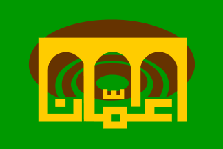
It seems that the Municipality of Greater Amman changed its flag or adopted a second one. It consists of the modern logo (without the logo's additional lettering, other than the large Arabic word "Amman") taking up the whole flag. It can be seen in a photo at the municipal site.
skyscrapercity.com has press information about the logo, posted on on 21.03.2009:Amman has now a new logo, launched to celebrate its centennial and promises a new era resembles the true soul of Amman as a vibrant, bustling, and peaceful city. The logo is just telling us about what Amman is and what it will be & how it will look like in the next years as a sparkling gem in the world with a prominent role, blossoms with the pluralism as a multicultural, international city, a major business & investment hub in the region, celebrating a worldwide festivals & events, globally recognized as a vibrant center of arts and cultural industry. This is the city where you will get a world-class health care and has a highly renowned medical tourism sector.A better photo of the flag, and an image of the logo graphic.It’s the paradise where you can live, study, work, and where you can find whatever you are looking for with an incomparable, delightful shopping experience.
Amman and the myth of the seven hills was the beginning of a promising future, they’re where the soul of Amman was first manifested, and it will be the nearest spot to reach your heavens. Amman is now a pilgrimage for every dreamer of the better, it’s a city with a soul.
Actually the flag version of the logo is somewhat different – there are no white borders between the different-colored hills, for example, and the hills start lower down, behind the white text. (Indeed it looks like the flag consists of the name moved up in the logo, over the hills, with the latter's white elements removed for contrast.)
Eugene Ipavec, 15 May 2011
Spelled as "عمّان" (ain, mim, shadda, alef, nun:
عمّان), usual transliteration "Ammān."
António Martins-Tuválkin, 18 May 2011
Apparently the flag and emblem was changed in 2009 to commemorate the Municipal Centenary. This article describes an invitation to design a new 'logo,' which emerged into a flag as well.
Jalal Muhammed, 06 February 2012
![[Municipality of Amman (Jordan)]](../images/j/jo-amman.gif) image by Jorge Hurtado, exported to gif by Santiago Dotor
image by Jorge Hurtado, exported to gif by Santiago Dotor
Gaceta de Banderas [gdb], no. 76, April 2002, includes a report by Michel Lupant on the flag of Amman, the Jordanian capital:
Flag of the city of Amman (Jordan): a green flag with yellow arch and dark brown circle [sic]. That flag flies on top of city buildings.The image actually shows a central logo-like emblem consisting of a golden stylised triple archway, whose base is replaced by some golden Arabic lettering, the whole backed by three "concentric" brown crescents reversed (i.e. with their points to bottom). I wonder if the Arabic writing – in the same style as the one used in the Takbir bordering the stripes of the Iranian flag – reads "Amman."
It looks like "عمّان" in the Kufic style, which seems indeed to be "ʿAmmān".
António Martins-Tuválkin, 09 January 2006
 image
by António Martins-Tuválkin, 27 April 2024
The Gaceta de Banderas image is wrong. A more accurate image of the old emblem and flag can be found here. The line of the letter alif (a) should extend to touch the upper symbol, which is a sequence of yellow arches. The text should be "حمّن" – "عمّان" has actually no meaning.
Jalal Muhammed, 04 and 06 February 2012
Wikimedia user Indolences accurately traced from official sources at
https://commons.wikimedia.org/wiki/File:Flag_of_Amman,_Jordan_(until_2009).svg.
The logo on this flag, as said, includes a highly stylized rendering of the
city name, spelled as "عمّان" (ain, mim, shadda, alef, nun).
Both pre- and post-2009 flags use this simplified spelling. The ultra-correct
spelling "عَمَّان | ʕᵃmᵃ⁼an" (fatha
on both ain and mim)
is not followed by either flag.
The incorrect image in Lupant’s article
would read rather "عمّن" (ain, mim, shadda, nun), not as Jalal is
quoted to have said — it’s still a word with no meaning in Arabic.
António Martins-Tuválkin, 27 April 2024