Last modified: 2014-06-29 by klaus-michael schneider
Keywords: diário de notícias | expolíngua portugal | armillary sphere | publicações europa-américa | pea | eea | ea |
Links: FOTW homepage |
search |
disclaimer and copyright |
write us |
mirrors

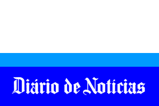
Diário de Notícias is the oldest portuguse newspaper in print. Atop its Lisbon headquarters two flag poles fly what seems to be the flag of this newspaper; the only other flag there, in a taller central pole, is the portuguese national flag. (And not the flag of the owning company, currently Lusomundo, S.A.)
The flag of Diário de Notícias is a horizontal triband of white, light blue and medium blue. On the lower stripe, the title head of newspaper, which has changed very little since its founding, set in white black-letter.
António Martins, 30 Oct 2005
The white part is half of the flag, specs about (27+7+20):81.
António Martins, 30 Oct 2005

Expolíngua Portugal is a yearly event organized by an
eponymous company, usually in Lisbon
and some times in Oporto.
It is a fair for companies and other entities in the language
trade — mostely foreign language schools and publishers,
but also some cultural institutions, visited by specialists and by
the general public. Its flag is white with the two-colored logo,
the slab serif capital lettering "Expolíngua" in green, above,
and "Portugal", in red; the first "o" is replaced by a circular
highly stylized armillary sphere.
António Martins, 16 Nov 2004

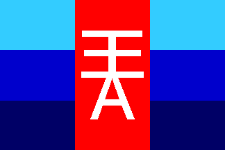
It shows the company monogram (double "E" over an "A")
white on the red central panel of a vert triband whose lateral panels are
horizontally divided in three blue parts — light, medium and dark,
from top to bottom. (This is another
flagoid, as the company logo shows
this design in a wavy pattern.)
António Martins, 09 Aug 2004
Anything below this line was not added by the editor of this page.