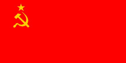
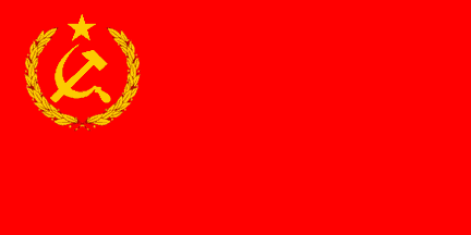
 image by António Martins, 27 December 2023
Last modified: 2024-01-13 by rob raeside
Keywords: hammer and sickle (yellow) | star: 5 points (yellow on red) | error | painting | lenin |
Links: FOTW homepage |
search |
disclaimer and copyright |
write us |
mirrors
 image by António Martins, 20 December 2005
A solid yellow star, (instead of red with yellow
edge) is a “simple” mistake to make, occurring even in soviet
flag depictions.
António Martins, 28 January 2001
 image by António Martins, 30 July 2007
On a
famous
painting of Lenin, the Soviet leader appears above a red banner.
It is complete with the finial, but the Soviet flag
is different. The star appears to be completely gold,
as opposed to with a gold outline, and the hammer and sickle are surrounded
by what appear to be olive branches. Also, the hammer and sickle
should not appear on the reverse side of the
banner. Although this flag is only in a painting, it is a very famous
image.
Dafydd Young, 07 September 2004
I received my Soviet flag made for me from a friend of mine. This flag
was made in Moscow at the factory that makes flags, Soviet and otherwise.
The emblem is a copper color, for sure, not a real yellow by any means, and
it have a solid star, placed on the hammer handle side of the emblem.
Steve Stringfellow, 11 December 2000
Since this is genuine soviet or russian made, it should be taken as a
“proof” of a certain relax in following the specs: Even though
details of the hammer and sickle varied a lot, the
star should always be located centered above the crossed hammer and sickle,
and never on the side like on this flag.
António Martins, 12 December 2000
 image by António Martins, 27 December 2023
The Soviet national flag with white emblem, instead of golden yellow is an
error perpetrated, e.g., on stamps — incl. many issued by the Soviet postal
authorities.
See eight of them at this
link, and I’m sure there’s many more. In most cases the error stems from
technical constraints, when few-color print is used, with text and other items
(usually) in black. Red is then used for the flag cloth, for emphasis, with its
emblem rendered as a negative space, showing though the paper color.
An
example of this is our Stamp with Flags #02620,
in our website at (image at [http://www.stamprussia.com/906b.jpg]),
which depicts also the U.S. and U.K. flags and was printed in three colors:
black, blue, and red — leaving paper-white to show the hammer-and-sickle emblem.
Some of these stamps are however typographically sophisticated and the
option of using white instead of yellow is harder to attibute to technical
issues: See
http://www.stamprussia.com/5031b.jpg stamp #02615
for one example.
And of course, technical issues may cause this design to
arise not only in print but in actual cloth flags too — when soviet flags used
red cloth with painted emblems, the dye often would discolorate, or even white
paint could be used instead of (golden) yellow in the name of expediency.
And not to mention that some Soviet flags were indeed by design red with
white charges — as in the naval jack of the o.p., or the
famous Banner of Victory.
António Martins-Tuválkin,
27 December 2023
 image by António Martins, 27 December 2023
Here’s another flag that hits both marks: A Soviet flag in 2:3 ratio, instead
of the official and usual 1:2, was a common sight in 20th century Western
represantations of the Soviet flag, incl. in flag books, more due to low
accuracy than to political animity — other non-2:3 flags of Western countries
get the same treatment, notably those of CH, US, and GB.
Surprisingly,
this design also features occasionally in Soviet sources, such as the Stamp with
Flags #02707, image at
http://www.stamprussia.com/5952b.jpg, that shows also (partly obscured by
the Soviet flag in question) the contemporary flag of Bulgaria — which is 2:3.
One could argue that the designer strived to display both flags in a
balanced, harmonious way, giving positional primacy to the Soviet flag and yet
constraining it to the Bulgarian ratio, and that’s neat, but if so it was an
one-off case and most 2:3 Soviet flags in Soviet sources do stemm from the same
lack of attention to detail of their Western counterparts.
To wit, this
other 1988 Soviet stamp, #02994 (more info at
http://commons.wikimedia.org/wiki/File:Soviet_Union_stamp_1988_CPA_5913.jpg
- that shows the Soviet flag alongside with the U.S. flag, and they are both
wrongly drawn in 2:3 ratio (while the Soviet ratio of 1:2 would be closer to the
US’s 10:19).
António Martins-Tuválkin,
27 December 2023