 image by Zachary Harden, 18 August 2019

Last modified: 2020-01-04 by rick wyatt
Keywords: united states | soccer | sporting kansas city |
Links: FOTW homepage |
search |
disclaimer and copyright |
write us |
mirrors
 image by Zachary Harden, 18 August 2019
See also:
Sporting Kansas City (or Sporting KC) is one of several clubs of Major League
Soccer, a soccer league that operates in the US and Canada. Formerly known as
the Kansas City Wizards (and Wiz before that) (formed in 1995, the club took its
current name and crest in November 2010.
Over the weekend, I went with my
wife to Children's Mercy Park to attend a Sporting KC match. (It is of note that
while this was Kansas City, this was on the Kansas side of the border, so this
part will make more sense in a bit.) Near the supporters stand, there are five
flag poles present. From the match that occurred, the flags were in this order:
US, Kansas, Sporting Club (the ownership group of the club), Sporting KC and the
San Jose Earthquakes (the team visiting).
The US flag was obvious, but I
will have a note about that later.
The use of the Kansas flag is mostly
to denote the location of the stadium. Kansas City is split between Kansas and
Missouri, yet both state flags will not be present in any way. This is similarly
done with the Kansas City Royals of Major League Baseball; their stadium is on
the Missouri side of the line so only the Missouri flag is used at their events.
Supporters cannot bring their own flags except via established supporter clubs
(the Cauldron and South Stand SC are the only two to my knowledge).
The
Sporting Club group flag is the company logo on a dark blue background. The logo
itself is a combination of the letters "SC" in a way that mimics the Rod of
Asclepius and the Nike of Samothrace in a shield. (Source:
https://www.kansascity.com/sports/spt-columns-blogs/the-full-90/article297254/Making-Their-Mark-The-aesthetics-of-Sporting-KC.html)
 image by Zachary Harden, 18 August 2019
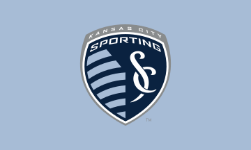
The logo for Sporting KC uses the same branding as the ownership group,
yet it is placed at the bottom right of the logo. The lighter blue stripes are
formed in a way to show that is Kansas and the other half of the badge
represents Missouri; this design was based off the actual border of the two
states
(https://www.onestopmap.com/wp-content/uploads/2018/03/666-kansas-plus-vm-usks-j-667m-1.jpg).
The original concept was credited to Chad Reynolds, the in-house graphic
designer and kit designer for the club; the rest of the logo was designed by the
company Adidas along with the specific font "Sporting Agency" that is used.
(Source:
https://www.kansascity.com/sports/spt-columns-blogs/the-full-90/article297254/Making-Their-Mark-The-aesthetics-of-Sporting-KC.html).
Their flag is the logo on a light blue background.
For MLS matches, the
opponent of Sporting is represented with a flag. The San Jose team had their
logo on an Argentina-blue color; an earlier match I went to this year had the
logo of LA Galaxy on a white background. There is also a secondary color palette
using the Sporting colors for the MLS logo that is used on a light blue flag
during the national anthem ceremony (the FIFA Fair Play flag is also present).
For FIFA matches, the recent CONCACAF tournament that was held at Children's
used this flag protocol on their poles; Trinidad and Tobago - Panama - Kansas -
USA - Guyana (https://media.gettyimages.com/photos/team-flags-fly-high-before-a-concacaf-gold-cup-match-between-trinidad-picture-id1152905815?s=612x612).
There are also supporter club flags, but I am not sure how many exist. I
own a copy of
https://twitter.com/KCCauldron/status/1142940031868424192/photo/1 (KC
Cauldron, the main supporters). The monogram is a combination of the letters
"KCC" and evokes some of the monogram logos of other teams in the city (Chiefs
of the NFL
https://www.brandsoftheworld.com/logo/kansas-city-chiefs-0, Royals of MLB
https://sportslogohistory.com/kansas-city-royals-primary-logo).
Zachary Harden, 18 August 2019
 image by Zachary Harden, 18 August 2019