 klaus-michael schneider
Keywords: venezuela | university |
Links: FOTW homepage | search | disclaimer and copyright | write us | mirrors

Last modified: 2021-08-26 by  klaus-michael schneider
Keywords: venezuela | university |
Links: FOTW homepage |
search |
disclaimer and copyright |
write us |
mirrors
See also:
Other Sites:
 image by Ivan Sache, 30
July 2017
On July 13 I spotted the flag of the Universidad de las Ciencias de la Salud
"Hugo Chávez Frías" (English: Health Science University "Hugo Chavez Frias"). It
was established by Decreto Presidencial (Presidential Decree) No. 1,317,
published on the Gaceta Oficial (Official Gazzete) No. 40,514, dated October 8,
2014, in the framework of the "Misión Alma Mater" (English: Alma Mater Mission)
(official website: www.misionalmamater.gob.ve, dead link,
https://es.wikipedia.org/wiki/Misi%C3%B3n_Alma_Mater), a government
program to change the whole educational system, specifically public institutions
(both high schools and universities). Alma Mater Mission
is a sub Mission of
Misión Sucre.
Source:
http://maiquiflores.over-blog.es/2016/06/inaugurada-universidad-de-ciencias-de-la-salud-en-venezuela-dr-carlos-alvarado.html
It is important to notice that several government programs are regulated
through these so called "Misiones" (Missions), encompassed
in the "Sistema
Nacional de Misiones" (Missions National System) (official website:
http://www.gobiernoenlinea.ve/miscelaneas/misiones.html, and new official website:
https://www.misionesbolivarianas.com/, and
https://es.wikipedia.org/wiki/Sistema_Nacional_de_Misiones).
Its flag is
a yellow horizontal flag with the logo (https://pbs.twimg.com/media/C5R_SrxWYAAy0l7.jpg) in the middle.
For additional
information go to UCS http://www.ucs.gob.ve (official website),
http://ucs.net.ve (semi-official website)
Esteban Rivera, 29 July 2018
 image by Ivan Sache, 6 March 2007
The flag of this university is at www.unimar.edu.ve
(defunct).
Dov Gutterman, 3 March 2002
The Flag of University of Margarita is dexter hoist; this is,
the hoist seen at the left of the observer and therefore the
logotype appears on the lower fly. The prevailing vexillological
custom in Venezuela is that the flags are dexter hoisted or with
the hoist sees to left of the observer. We can describe the Flag
of University of Margarita in this way: a field with approximate
ratio 2:3 diagonally divided from upper fly to lower hoist in two
stripes: blue and white, showing on this last one the logotype of
the Institution (blue circle with letters U in superior part and
M in the inferior part, both white)
Raul Orta, 3 March 2003
The University of Margarita, nicknamed "Alma Mater del
Caribe", is located on the Margarita island, state of Nueva Esparta, 38 km off the north-eastern
coast of Venezuela. This private University was founded by
Presidential Decree No 34 on 20 November 1998; it was inaugurated
on 1 November 1999.
Source: www.unimar.edu.ve.
Ivan Sache, 6 March 2007
 image by Guillermo T. Aveledo, 15 September 2000
Universidad Metropolitana - Metropolitan University - Caracas
Guillermo T. Aveledo, 15 September 2000
In May 1964, Eugenio Mendoza founded a civil association to
promote the foundation of a University. On 21 October 1970, the
University National Council authorized the foundation of
Universidad Metropolitana (Unimet) in Caracas. The University was
inaugurated the next day in the former seat of Colegio América
in San Bernardino. In 1976, the University moved to its current
seat in La Urbina and built a 100-ha campus. The University has
now 5,000 students and 500 professors
The University
website shows the flag of the University with a
"floating pattern". There are a few differences with
the flag shown above:
- the colour of the flag is more orange and less red
- the UM logotype is orange and not black
- there are seven upper and five lower orange "stripes"
instead of five and five.
Ivan Sache, 4 March 2007
 image by Ivan Sache, 9 January 2019
unet.gif) image by Raul Orta, 26 July
2002
image by Raul Orta, 26 July
2002
The Emblem
Based on www.unet.edu.ve.
Dov Gutterman, 22 July 2002
The Flag - Attributes - The National Experimental University
of Táchira is an educational entity located on the Táchira
State, at the Southwest of Venezuela. Its flag consists of a
field with approximate ratio 2:3 or square and half of length,
horizontally divided on two stripes: white the superior and blue
the inferior. The Official Emblem of the Intitution in blue to
the canton completes the conjunct.
The Emblem - Attributes and Semiology - It consist in a super
streamlined and kinetic arrange of the letters U and T that
alludes to the name of the Institution.
Source: National Experimental University of Táchira Web Site www.unet.edu.ve.
Raul Orta, 26 July 2002
UNET was established by Presidential Decree No. 1,630, signed on 27 February
1974. Classes started on 23 June 1975.
The symbols of UNET are described
in the Norm on the institutional symbols of UNET, last amended on 13 June 2017
by the University Council.
Article 3 [not modified]
The flag consists
of a rectangular panel with proportions 1/square root of 2, composed of two
horizontal stripes of equal dimensions, white in the upper part and light blue
in the lower part, charged with the UNET imagetype in the upper left part.
Article 7 [modified]
The UNET imagetype is inscribed within an imaginary,
perfect square; it shall be of blue color. It is composed of parallel, straight
lines that represent letters "U" and "T", placed in a way visually forming the
acronym "UT". The end of each line is longitudinally cut centerwise, in order to
reduce distance from the contiguous line. The base of letter "T" entering letter
"U" forms a plane rectangle filled with the color of the straight lines. In the
lower part of the imagetype and outside the virtual square is the word "UNET".
Paragraph 1. The imaginary square inscribing the imagetype shall be a protected
area; it is not allowed to change the original design in its shade, shape,
proportions, function and balance of the image.
Paragraph 2. When the
imagetype has to be used in a stand-alone way, the imaginary square may have a
colored background using the colors approved in the university's matching legal
prescription.
http://secretaria.unet.edu.ve/archivos/B-42_Normas_Simbolos_Institucionales.pdf
UNET Symbols' page shows a drawing of the flag with the imagetype
without the word "UNET", while photos confirm that the complete imagetype
appears on the flag.
http://unet.edu.ve/institucion/simbolos.html
Photos
http://www.unet.edu.ve/eventos-y-noticias-externas/4538-unet-y-fundamotrans-estrechan-lazos-de-cooperacion.html
http://www.unet.edu.ve/noticia-unet/3971-club-de-hapkido-abre-sus-puertas-en-la-unet.html
https://www.linkedin.com/feed/update/urn:li:activity:6411664642728349696/
http://deportivotachira.com/tachira-y-anzoategui-disputaran-la-copa-41-aniversario-de-la-unet/
https://lanacionweb.com/regional/unet-y-fundamotrans-estrechan-los-lazos-de-cooperacion/
http://amigosegresadosunet.blogspot.com/2016/12/mensaje-de-fin-de-ano-del-ciudadano.html
Ivan Sache, 9 January 2019
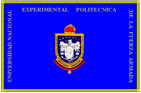 image by Raul Orta, 2 April 2003
unefa.gif) image by Raul Orta, 2 April 2003
image by Raul Orta, 2 April 2003
The standard and Coat of Arms of the National Experimental
Politechnic University of the Venezuelan Armed Force (Initials
UNEFA in Spanish), the former "University Politechnic
Institute of the National Armed Forces" (Initials IUPFAN in
Spanish)
1.- STANDARD - ATTRIBUTES - Consist in a regular (rectangular)
field with ratio 2:3; this is, square and half of longitude. On
its blue field gilded fringed appears the Coat of Arms of the
Institute in all its official attributes and surrounding it the
denomination "UNIVERSIDAD NACIONAL EXPERIMENTAL POLITECNICA
DE LA FUERZA ARMADA" (NATIONAL EXPERIMENTAL POLITECHNIC
UNIVERSITY OF THE VENEZUELAN ARMED FORCE) in golden roman capital
letters.
- SEMIOLOGY - Blue signs the Great Ideals, High Spirit, the
Loyalty and the Perseverance which anime the action and
activities which belongs to the Institute whilst its Coat of Arms
and denomination rebounds the privilege of the formation in its
classrooms making honor to its motto: "EDUCATIVE
EXCELLENCE".
2.- COAT OF ARMS .- ATTRIBUTES - Consist in an Spaniard shape
with only one quarter or simple Azure (blue) field which charges
an emblematic conjunct integrated by an eagle with downed wings
nascent from a tierced round shield superposed to an anchor and a
balance, with a constellation of seven five-pointed stars
disposed in arc on the chief, all in Argent (white). Border in Or
(yellow) with the inscription "UNIVERSIDAD NACIONAL
EXPERIMENTAL POLITÉCNICA DE LA FUERZA ARMADA"
("NATIONAL EXPERIMENTAL POLITECHNIC UNIVERSITY OF THE
VENEZUELAN ARMED FORCE") in gothic capital letters enameled
on Sable (black), disposed on the flanks and base of the Coat of
Arms. As external ornaments, the blazon shows a torch in Or
(yellow) flamed in the same enamel and Gules (red) disposed at
the back of the field and a pennant tierced in Or (yellow), Azure
(blue) and Gules (red) that charges as mottoes the ephemeris
"3 DE FEBRERO DE 1974" (February 3rd, 1974) and
"26 DE ABRIL DE 1999" (April 26th, 1999) in gothic
capital letters enameled in Sable (black).
- SEMIOLOGY - The field is enameled in Azure for sign the Great
Ideals, the High Spirit, the Loyalty and the Perseverance which
inspired the action and activities which belongs to the
Institute. The Constellation of seven five-pointed stars
symbolizes the Venezolanity and remembers the Constance in the
Services; by one hand and by the other, the shine of the Personal
and Professional Virtues of the Docent, Administrative and
Pupil's Personnel of the University. The central emblematic
conjunct symbolizes the union of the four components of
Venezuelan Armed Force: the round shield represents the Army; the
anchor remembers the Navy; the eagle symbolizes the Aviation and
the balance alludes to the National Guard: all enameled in Argent
for sign the Clarity, the Eloquence, the Integrity and the Truth
required of the Personnel adscript to the Institute in the
exercise of their functions The border in Or remembers the Joy,
the Constance, the Generosity and the Nobleness: virtues which
adorn who is called to conduce the destinies of the University
whilst its denomination rebound its Corporative Identity, Values,
Traditions and Objects. The torch represents the Knowledge and
the Study which encounter on the Institute's classrooms a
propitious and fecund place for its development and progress. The
pennant, reaffirmation of the Patriotic felling which encounters
echo in the Institute, shows the dates of its foundation and
elevation to the University range as a tribute to everyone who
formed and form a part of it for the realization of all that
contract its motto: EDUCATIVE EXCELLENCE for contribute
efficiently to the Progress of our Homeland.
3.- HISTÓRICAL SYNTHESIS - It was created by Colonel (Venezuelan
National Guard) MARIO MUÑOZ CABRERA. Initially was conceived for
represent INSTITUTO UNIVERSITARIO POLITÉCNICO DE LAS FUERZAS
ARMADAS NACIONALES (UNIVERSITY POLITECHNIC INSTITUTE OF NATIONAL
ARMED FORCES), which with the pass of the time was elevated to
the category that today have as UNIVERSIDAD NACIONAL EXPERIMENTAL
POLITECNICA DE LA FUERZA ARMADA - UNEFA (NATIONAL EXPERIMENTAL
POLITECHNIC UNIVERSITY OF THE VENEZUELAN ARMED FORCE).
Raul Orta, 2 April 2003
The UNEFA
official website now shows and describes a different shield . Since
there is no reason to question Raul Orta's report, it is clear
that the shield was changed. The new shield has eight stars
instead of seven and shows a portrait of Simon Bolivar; it was
therefore undoubtly adopted as a symbol of President Chávez'
Bolivarian Revolution.
The burning torch represents sport as the spirit of the
University. The eight stars represent the eight provinces of
Venezuela. The book symbolizes wisdom, perseverance and
self-abnegation in the studies. The central figure (left) is a
portrait of Simon Bolivar, representing the ideology of the
Bolivarian process. The central figure (right) represents the
four components of the armed forces. In the previous version of
the shield, there was no book and the emblem of the armed forces
was placed directly on the blue background of the shield. The
tricolor scroll bears the name of the country and the date of
foundation of UNEFA, 26 April 1999 (by Presidential Decree No
115). On the former shield, the scroll bore two dates (not shown
on the image but described in the companion text), 3 February
1974 having been deleted from the current scroll.
Ivan Sache, 7 March 2007
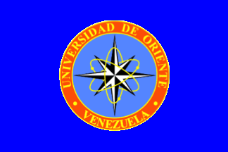 image by Ivan Sache, 30 October 2014
Universidad de Oriente (UDO) was established by Decree-Law No. 459 of 21
November 1958. Basic Course started in Cumaná (Sucre State) on 12 February 1960.
Centers were subsequently established in Maturin (Monagas State; School of
Agronomic and Oil Engineering, October 1961), Ciudad Bolívar (Bolívar State;
School of Medicine and School of Geology and Mining, 8 January 1962), Barcelona
(Anzoátegui State; School of Engineering and Chemistry, 9 January 1963), and
Nueva Esparta (Nueva Sparta State; Basic Course, 21 January 1969).
The flag of UDO is King blue with the university's emblem in the middle. The
flag shall be hoisted in the presidium at the left of the national flag.
The emblem of UDO, designed by the founding director, Dr. Luis Manuel Peñalver,
features a star shaped like a compass rose, divided into eight equal, white and
black parts, whose points indicate the points of horizon, principally the
Orient, from which raises not only the sun, but also all the stars that
symbolize Universidad de Oriente. The star is interlaced with ellipses formed by
the movement of three yellow atoms, as a representation of science, and placed
on a cyan blue disk surrounded by an orange ring bordered yellow and inscribed
with "UNIVERSIDAD DE ORIENTE" (top) and "VENEZUELA" (bottom), in yellow letters
of the Times New Roman font.
Source:
http://www.udo.edu.ve/index.php/la-universidad/simbolos-oficiales -
University's website
Ivan Sache, 30 October 2014