
Last modified: 2025-04-23 by rick wyatt
Keywords: boston | massachusetts | suffolk county |
Links: FOTW homepage |
search |
disclaimer and copyright |
write us |
mirrors
![[Flag of Boston]](../images/u/us-mabos.gif) image by Dave Martucci, 1 November 2015
image by Dave Martucci, 1 November 2015
See also:
The Columbus Day Committee proposed the City Flag in 1913. It was introduced into the City Council 16 January 1914 but was not adopted until 30 January 1917.
The design is the City Seal in dark blue on white and buff centered on a dark blue field. The proportions are 7:10.
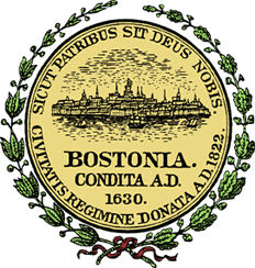
The City Seal was designed in 1823 and slightly modified in 1827. Designed by John R. Penniman (New England's most famous flag painter of the 'golden era'), it consists of a view of the City, including the Massachusetts State House, and ships in the harbor in the foreground depicted in dark blue on white. Below is the legend 'Bostonia Condita A.D. 1630' in dark blue and encircling the seal at the top is the motto 'Sicut Patribus Sit Deus Nobis', which means 'God be with us as He was with our fathers', and 'Civitatis Regimine Donata A.D. 1822' around the bottom. These last two inscriptions appear in dark blue on a buff circle, fimbriated white. This version of the seal on the flag is slightly different than the official emblem.
The ordinance specifies the flag is to be used on City Hall and on the Boston Common and that it is to be made of bunting with the seal showing through to the back side. The ordinance also specifies a 'Municipal Standard' to be made of silk for use in parades and other occasions when
the mayor is present. The City Seal appears on the obverse and a depiction of the Trimountain is supposed to appear on the reverse. No illustration of this distinctive reverse is known to exist. The Standard is supposed to be fringed in buff.
The colors of the flag and standard, 'Continental blue' and buff are the colors of the Revolutionary War uniforms of Boston Soldiers. In practice, the City Flag is used exclusively and is often fringed.
Dave Martucci, 9 March 1998
"Civitatis regimine donata A.D. 1822" at the bottom means that
Boston was chartered as a city in 1822.
Phil Cleary, 1 November 2015
The shade of blue is "Continental" blue (as in the Continental Army of 1776), but every representation I have ever seen here in town is a light blue. I don't think it has to do with fading in the weather. Either the manufacturer doesn't know the official specifications, or someone changed them.
The "yellow" is supposed to be "buff" (again, a 1776 uniform color) but I have never paid close enough attention to the actual flag specimens to notice that. There's not much of it on the flag in any event.
Al Kirsch, 14 November 2000
Most of the flags I've seen in my 50+ years here actually have a lighter shade of blue, what I would describe as "sky blue." But I have seen the occasional flag with the shade shown in the image. I suppose that the flag flown
at City Hall would be as official as one could get. But the last time I was there, the flag on one side of the building was sky blue; the one on the other side was the somewhat darker shade, more like the one on the image above. I have no idea what the official shade is.
Phil Cleary, 18 September 2002
"Continental" blue is a reference to the military uniforms worn by the Continental Army during our Revolutionary War (1775-1781). By all definitions it is a rather
dark blue color and certainly not celestial or sky blue. It is somewhere between what is termed royal blue and navy blue as far as I can determine from original existing material. Here is a scan of the original 1918 illustration of the Boston City Flag and, as you can see, the printing technology of 1918 was not that great so the color is not uniform throughout the image but I think it conveys the true intent for the color. I did the best I could to match that to the 16 color palette.
Dave Martucci, 3 November 2015
The flag illustrated above as the Boston City Flag is, in fact, the pattern used at City Hall and for most purposes. Usually the seal “shows through” to the reverse, but at least one large flag flying in City Hall Plaza on 22 March 2017 had the seal sewn on to just the obverse and no design at all on the reverse.
The actual specs for “Continental Blue” and “Continental Buff” are a bit
uncertain but as near as I can figure out, they should equate to the RGB codes
R-70, G-121, B-182 for the blue and R-240, G-220, B-130 for the buff. These are
not the shades in common use today.
Dave Martucci, 26 January 2019
![[Flag of Boston]](../images/u/us-mab'r.gif) image by Dave Martucci, 1 November 2015
image by Dave Martucci, 1 November 2015
![[Flag of Boston]](../images/u/us-mabos).gif) image by Dave Martucci, 1 November 2015
image by Dave Martucci, 1 November 2015
![[Municipal seal]](../images/u/us-mabos)2.gif) image located by Paul Bassinson, 21 August 2019
image located by Paul Bassinson, 21 August 2019
Source:
http://www.masshome.com/
Paul Bassinson, 21 August 2019
![[Flag of Boston]](../images/u/us-mabos-2017-v.gif) image by Dave Martucci, 26 January 2019
image by Dave Martucci, 26 January 2019
Custom made variants are used by the City Council in its
chambers and function rooms. These have a fully colored seal with gold instead
of the required buff highlights and the blue field is very dark compared with
the flags that actually fly outside the windows. They measure about 3˝’ x 5’ (1 m
x 1.5 m) and the seals are hand painted and appliquéd to each side. I expected to
find the Trimountain on the reverse, but alas! These flags are fringed in gold,
not the statutory buff.
Dave Martucci, 26 January 2019
I have studied Boston's flag history for decades. Most of the images that exist are technically wrong as are most of the flags that exist. Here is a synopsis of my research to date.
![[Flag of Boston]](../images/u/us-mabos3.jpg) image by Dave Martucci, 25 August 2019
image by Dave Martucci, 25 August 2019
The Allen & Ginter Cigarette Co. of Richmond, Virginia published a version of the Boston City Flag on a Cigarette Card in 1887 that shows the seal surrounded by piles of books with the lamp of education at the top and a small wreath tied with a red ribbon at the bottom.
![[Flag of Boston]](../images/u/us-mabos4.jpg) image by Dave Martucci, 25 August 2019
image by Dave Martucci, 25 August 2019
![[Flag of Boston 1907]](../images/u/us-mabos07.gif) image by Dave Martucci, 26 January 2019
image by Dave Martucci, 26 January 2019
The earliest flag to represent the City of Boston that I can find in documents was adopted in 1907 for Boston's Old Home Week, 28 July to 3 August of that year. There were several variants and two basic forms used, a flag and a "bannerette". The design was the same in all of the versions except for the field color. On the flags the emblem is shield-shaped with dark blue at the top and bottom and a stylized three-hills emblem also in dark blue in the center.
The same emblem appears in the upper portion of a long narrow swallow-tailed banner but the upper and lower blue areas are rendered as stripes, no shield shape. The background of the shield and the center of the emblem on the "bannerette" is white. The field color for general purposes is white. The flag's standard size is 4' x 6' while the "bannerette" is 9.5' x 2'. Residences and businesses were encouraged to fly this emblem during the week.
Dave Martucci, 1 November 2015
My previous information was based on the Boston Globe article I cited (Boston
Globe, "Emblematic of the three hills", 23 June 1907 p. 16.) but the original
copy I received from the Globe had one line of text, just five words, unreadable
but later in the article referenced “… a white flag with the blue and white
symbols …” so I thought I was good to go. Turns out the missing five words were
“This appropriate green emblem, with …” and that changed everything. I have
since found a badge from this event showing the three hills in green with the
two blue bars and on 28 July 1907 there was a letter to the editor from George
G. of Everet, Massachusetts, published in the Boston Sunday Post opposing the
special flags with the following statement, “What significance does a white
streamer with two blue stripes and three dabs of green have to the stranger
coming to our city, or to those who are coming home for this particular
occasion?”
Dave Martucci, 26 January 2019
![[Flag of Boston 1907]](../images/u/us-mabos07-bann.gif) image by Dave Martucci, 26 January 2019
image by Dave Martucci, 26 January 2019
‘Bannerettes’ were the primary symbols used abundantly while the flag appears
to have had limited usage.
1907 Old Home Week Bannerette.gif
As near
as I can tell from a few tidbits of information I have found, the City
Departments variants of the device were pretty much confined to ‘bannerettes’
although it is possible there were flags as well. The variations were strictly
limited to field colors with the emblem remaining green-white-blue. The police
flag color is not specifically stated but must have been a light blue in order
for the design to work.
Dave Martucci, 26 January 2019
Fire, Police, Sanitation & Health and Parks & Water Departments
![[Flag of Boston 1907]](../images/u/us-mabos07f.gif)
![[Flag of Boston 1907]](../images/u/us-mabos07p.gif)
![[Flag of Boston 1907]](../images/u/us-mabos07h.gif)
![[Flag of Boston 1907]](../images/u/us-mabos07k.gif) image by Dave Martucci, 26 January 2019
image by Dave Martucci, 26 January 2019
Special designs were also implemented for Boston's municipal departments. The flag and "bannerette" were the same design with different field colors; red for the Fire Dept.; blue for the Police Dept. (presumably a light shade, although the materials are silent on that point); yellow for Sanitation and Health Depts.; and green for the Park and Water Depts.
The three hills of course represent the original reference for Boston, the Trimount or Trimountain. The upper and lower blue areas represent the "ocean and rivers".
Reference: Boston Globe, "Emblematic of the three hills", 23 June 1907 p. 16.
Dave Martucci, 1 November 2015
![[Flag of Boston]](../images/u/us-mabos13.gif) image by Dave Martucci, 26 January 2019
image by Dave Martucci, 26 January 2019
There is an actual color photograph of the obverse of the 1913 Columbus Day
Municipal Standard laid out on an undated proof sheet supplied by a publisher to
the Boston Arts Commission (BAC) which tantalizingly refers to an image of the
Trimountain seal on page 70. Unfortunately, no book with these images appears to
exist nor does the BAC have any other record of this. This flag has a unique
seal design that only shows the city and no shipping with the Massachusetts
State House somewhat highlighted. Both the large bunting flag and the full size
Municipal Standard bore this seal design in Continental Blue, White and
Continental Buff. The Standard was fringed in buff and had blue and buff colored
ties at the hoist to allow for mounting on a pole. The 1913 Standard served for
many years as the de facto Municipal Standard.
There was also a
third flag used in the Columbus Day Parade described as “The smaller silk flag
has the city seal painted in oil colors, while the reverse is a modification of
the face.” Ref: Boston Globe, “Boston flag raised”, 14 October 1913, page 5.
This design, along with the long-sought-after Trimountain design, was chosen
from the 11 finalists in the contest held by the Public Celebration Committee.
There was some back and forth about getting approval for it from the BAC, which
did eventually approve two aspects of the flag, the colors Continental Blue and
Continental Buff, and the concept of the city seal in the center.
Dave
Martucci, 26 January 2019
![[Flag of Boston]](../images/u/us-mabos17.gif)
![[Flag of Boston]](../images/u/us-mabos17rev.gif) obverse and reverse,
images by Dave Martucci, 26 January 2019
obverse and reverse,
images by Dave Martucci, 26 January 2019
In 1911 there was talk in the papers about Mayor John "Honey Fitz" Fitzgerald (AKA "The Singing Mayor") looking for City Flag ideas. Reference: Boston Globe, 3 February 1911 p. 10.
In 1913, the Boston Columbus Day Committee called for designs for a Boston City Flag on 31 August 1913, to be featured in the annual parade held 12 October of that year. The competition closed on 12 September and 11 designs were chosen as finalists. Eight of them were illustrated in the Boston Globe ("Boston Flag Designs to be Shown", 16 September 1913 p.4). From these, two different designs were combined to become the final design, which was blue with the city seal in
"blue and buff" on one side and the Trimountain on the other side.
On 16 January 1914, Mayor Fitzgerald transmitted a proposed ordinance and "3 cuts" illustrating the "proposed municipal standard" to the City Council for adoption of a City Flag and Municipal Standard. The ordinance languished for several years and it was finally adopted 30 January 1917 by the City Council. Reference:
Boston City Council Reports of Proceedings 1914, pp. 378-379.
I am still searching for the "3 cuts" the Singing Mayor sent to the Council.
Chapter 8 of the Revised 1914 Ordinances of the City of Boston that was printed c. 1918 shows a color illustration of the obverse of the City Flag. This does not seem to be included in today's ordinances.
The Ordinance established two flags. The City Flag which is made of bunting and is Continental Blue with the City Seal in Blue and Buff (and white) in the center, the reverse of which is the same image reversed (it's important to note the ordinance clearly says the "seal showing through the bunting" is the reverse side image).
The ordinance also created a silk Municipal Standard (see below).
Dave Martucci, 1 November 2015
Bert Poole "Cartoon"
![[Flag of Boston]](../images/u/us-mabos17).gif) image by Dave Martucci, 26 January 2019
image by Dave Martucci, 26 January 2019
Following the Columbus Day event, the concept was codified as an ordinance
and sent to the City Council which promptly referred it to a committee for
consideration. The actual final design was to be approved by the BAC, who spent
some time on the project in 1916 by hiring a famous local artist, Albert “Bert”
Poole to create original "cartoons" of the seal and Trimountain for the final
flag. This he did and on 20 July 1916, his work was done.
Dave Martucci, 26 January 2019
Of interest is the requirement in the ordinance that the Standard and the city's flags are to be in the custody of the City Messenger. Inquiries to the present City Messenger have so far gone unanswered. Edward Leary who was City Messenger from 1896 to 1943 is credited by the Boston Globe with the design of the flag ("Edward J. Leary, City Messenger, Retires Today", 31 May 1943, p. 12).
The full text of the 1917 ordinance:
CHAPTER 8.
Revised Ordinances 1914.
Establishing the Municipal Standard and City Flag.
SECTION 1. The municipal standard of the City of Boston, which is hereby established, shall be made of silk of the
colors designated, namely: Continental blue and buff, and shall be five feet in length and three and one half feet in width, or in proportion thereto. Provided, that a city flag of like design and colors may be made of bunting for outdoor
display, the size of such bunting flag to depend upon the place of display. The body of the Standard shall be blue, as specified, with the official city seal embroidered in the center; and two rings of white shall encircle the seal. The
reverse of the municipal standard shall bear a representation of the Trimountain. The city flag shall have no reverse except the seal showing through the bunting, the seal to be painted on or woven in the fabric. The municipal standard shall
have a fringe of Continental buff; the city flag to be without fringe.
Sect. 2. The color herein specified shall be the official colors for the city of Boston, namely: Continental blue and Continental buff.
Sect. 3. The city flag shall be displayed on City Hall and may be displayed on Boston Common on occasions when the national flag is ordered displayed.
Sect. 4. The municipal standard of silk may be carried or displayed in parade, at reviews, and on other official occasions when the mayor is present and when directed by him. Boston organizations may have copies of the municipal standard on approval by the mayor.
Sect. 5. Neither the municipal standard nor the city flag nor any reproduction shall be used for any commercial purpose, and no advertising device shall be placed upon it or used in connection with it; and the municipal flag or standard shall not be used for any purpose not authorized by this ordinance, except with the permission of the mayor.
Sect. 6. Any person violating any provision of section five of this ordinance shall be punished by a fine not exceeding twenty dollars for each offence, and not only the person actually doing the prohibited thing, but also his employer and every other person concerned in so doing shall be punished by such fine.
Sect. 7. The city messenger shall be custodian of the municipal standard and of the city flags that are the property of the city.
Sect. 8. This ordinance shall take effect upon its passage.
Approved January 30, 1917.
Dave Martucci, 1 November 2015
![[Flag of Boston]](../images/u/us-mabos17pro.gif)
![[Flag of Boston]](../images/u/us-mabos17prorev.gif) obverse and reverse,
images by Dave Martucci, 26 January 2019
obverse and reverse,
images by Dave Martucci, 26 January 2019
A report was apparently forwarded to the City Council; it was reprinted in the City Annual Report for FY ending 1 February 1917 and the report was dated 15 February 1917. Interestingly, it included buff stripes as a part of the design, a feature that was not adopted, although the actual adoption has a conflict in that it refers to both the original ordinance wording of the seal on a blue field and to the BAC Report that has that design with narrow buff stripes at the top and bottom, each 1/12 the width of the flag. The overall size to be 7:10 with the seal 3.5 in height (half of hoist measurement) and “No device of any kind on the reverse”.
On 23 February 1917, the BAC minutes noted “The following suggestions from
Mr. [Columbus Day Committee Secretary E.B.] Mero, regarding the new Civic Flag,
were reported,
1. That the drawings of the flags should be framed under
glass.
2. That properly dyed samples of both bunting and silk be obtained and
kept as a record.
3. It has been brought to his attention that there should
be a beacon on the centre hill of the ‘Trimountain’.”
There is no record
the BAC ever acted on any of these suggestions.
The Official design adopted 30 January 1917 showed the City Seal design drawn
by Bert Poole and is officially the design still in use today, although it is
never actually used.
Dave Martucci, 26 January 2019
![[Flag of Boston]](../images/u/us-mabos17std.gif)
![[Flag of Boston]](../images/u/us-mabos17stdrev.gif) obverse and reverse,
images by Dave Martucci, 26 January 2019 (speculative interpretation of
reverse)
obverse and reverse,
images by Dave Martucci, 26 January 2019 (speculative interpretation of
reverse)
The ordinance also created a silk Municipal Standard whose obverse is the same as the City Flag's obverse, except for the addition of buff-colored fringe on three sides. The reverse of the Standard, however, is an image of the Trimountain. To date I have not been able to find an exact image of that side of the Standard. I have, however, located several contemporary images of the Trimountain and have created an image based on those and my speculation as to how the image may have appeared on that flag. Some critics of the image have stated that it was displayed in conjunction with the word "TRIMOUNTAIN" so that is how I show it. Please note the image of the reverse of the Municipal Standard of Boston attached herewith is my interpretation and may not be an accurate image of the original flag.
Dave Martucci, 1 November 2015
![[Sully's Irish flag]](../images/u/us-mabos-ire.gif) image by Dave Martucci, 27 January 2019
image by Dave Martucci, 27 January 2019
On St. Patrick’s Day, 17 March, Boston becomes Irish in every way. Widely
displayed on that day is “Sully’s Irish Flag” (technically named “Sully’s Irish
Logo Banner”). It is the Irish tricolor with the white bar transformed into a
shamrock. Some consider it Boston’s unofficial flag for that day.
https://www.sullysbrand.com/products/sullys-irish-logo-banner.
The
flag is the product of Sully’s, a sports brand company of the city founded by
Chris Wrenn. The company started in 2000 when the founder began to hawk tee
shirts and other items with Boston-centric logos and slogans on the sidewalk
outside Fenway Park, home of the Boston Red Sox baseball team.
Dave Martucci, 27 January 2019
![[Boston Olympic Committee]](../images/u/us-mabos-boc).gif) image located by Esteban Rivera, 16 April 2023
image located by Esteban Rivera, 16 April 2023
For the 2008 Olympic Games, the cities that applied to become candidate cities
for 2008 Summer Olympics were Bangkok, Cairo, Havana, Kuala Lumpur and Seville.
Candidate cities (cities which were granted "candidate city" status and thus
were allowed to use the Olympic Rings in their proposal) were Beijing, Osaka,
Toronto, Istanbul and Paris.
A report therefore of a Boston 2008 proposal
was merely a "proto-candidacy" logo since it did not make even the first cut,
perhaps because it was not endorsed by the local NOC. The process had been
around for quite some time, as follows:
Boston Organizing Committee was formed in 1990 by a self-described “gang of six’’ who wanted to explore the idea. The group was originally called the Boston Olympic Organizing Committee, but the United States Olympic Committee and International Olympic Committee—a couple of bodies the group had no interest in upsetting—quickly got in touch and told them to change the name. It was comprised of architect Webb Nichols, attorney Fletcher Wiley, sports agent Steve Freyer, sports academic John Cheffers, former Boston University athletic director John Simpson, and businessman and film producer Rikk Larsen. The 1993 study said the BOC had done some surveying, finding 80 percent support for pursuing an Olympic bid, though it didn’t provide any further details on that surveying. For all the optimism, the BOC never formally submitted a bid to the United States Olympic Committee.The group’s early meetings were characterized by “naivete’’ about the bidding process, Larsen told Boston.com. Its first thoughts went to the 2000 Olympics—they even made pins with a “Boston 2000’’ logo. They realized quickly enough that they didn’t have time for that—and once Atlanta was chosen to host the 1996 Games, it was a lost cause anyway. So the BOC shifted gears, first considering the 2004 games (which were awarded to Athens) before eventually targeting 2008. In 1993, the BOC put out a "feasibility study" looking at what it would take to run the Olympics in Boston. The study, reviewed in full by Boston.com, was not that different from the bidding documents released (source: https://www.wbur.org/news/2015/01/21/boston-2024-olympics-bid-images) by Boston 2024 (http://www.2024boston.org/docs) in January. It features plans for venues, a look at possible costs, and a pitch for why Boston’s infrastructure is well-suited to a host city bid. Boston was not selected as an official Candidate City for the 2024 Summer Olympic Games which were eventually awarded to Paris.
Source: https://www.boston.com/news/local-news/2015/02/06/looking-back-at-bostons-olympic-plans-from-1993
Esteban Rivera, 16 April 2023