
Last modified: 2022-10-22 by bruce berry
Keywords: rhodes university | pretoria university | walter sisulu |
Links: FOTW homepage |
search |
disclaimer and copyright |
write us |
mirrors
 image
by Andre van de Loo, 27 Mar 2011
image
by Andre van de Loo, 27 Mar 2011
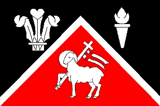
The flag of the Fish Hoek High Schools (located in
Fish Hoek in the Western Cape),
is in the proportion of 2:3, divided per upright chevron with black and cherry
red below. Over the partition line is a narrow white upright chevron 1/20th
the width of the flag. There is a plume of three ostrich feathers bound in the
upper hoist, in the upper fly a torch and beneath the chevron a paschal lamb,
all in white, the lamb bearing a swallow-tailed pennant of St. George.
This flag is a heraldic banner of the Coat-of-Arms
registered by the Bureau of Heraldry for the Fish Hoek
High Schools, under certificate number 2262 dated 07 December 1990 (Source:
SAVA Newsletter, 2/91, 15 November 1991).
Andre van de Loo, 27 Mar 2011
 image
by Andre van de Loo, 27 Mar 2011
image
by Andre van de Loo, 27 Mar 2011
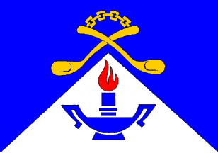
The flag of the Gazankulu College of Nursing (located in the former Gazankulu Homeland in what is now Limpopo Province) is in the proportion of 2:3, is divided per upright chevron, blue and white. The blue is charged centrally with two spoons in saltire, handles upwards and joined by a chain, embowed, all in gold. On the white appears a double-handled candlestick and candle, both in blue, with the candle enflamed in red. This flag is a heraldic banner of the Coat-of-Arms registered by the Bureau of Heraldry for the Gazankulu College of Nursing under certificate number 2088 dated 09 August 1989.
The spoons joined by a chain, which are also found on the
former Homeland flag of Gazankulu, are used by the
Shangaan people during tribal ceremonies. Being
carved out of a single block of wood, the spoons cannot be separated
and harmony must prevail between the two people wishing to
eat with them. Their appearance is a signal that
disputes must be settled and / or that hospitality
must be offered to strangers. The candle, much used in the rural areas of South
Africa, is in lieu of the traditional nurses' lamp (Source: SAVA Newsletter,
2/91, 15 November 1991).
Andre van de Loo, 27 Mar 2011
 image by
Randy Young, 01 Dec 2014
image by
Randy Young, 01 Dec 2014 image
by Martin Grieve, 29 Mar 2005
image
by Martin Grieve, 29 Mar 2005Rhodes University is located in Grahamstown in the
Eastern Cape province of
South Africa. The University was established on 31 May 1904 as the Rhodes
University College, named for Cecil John Rhodes, diamond and gold magnate,
imperialist, sometime Prime Minister of the Cape Colony and founder of the
British South Africa Company which colonised Rhodesia (today
Zimbabwe and
Zambia). Donations towards its founding came largely from the trustees of
Rhodes's estate (he had died in 1902) and De Beers Consolidated Mines (which he
had founded), as well as several public bodies in what was then called the
Eastern Province.
On 10 March 1951 Rhodes became an independent university, to which the
University of Fort Hare founded in 1916 in the near-by town of Alice) was
affiliated until 1959. Under the apartheid dispensation Fort Hare originally
accepted Black students only while Rhodes catered for white students.
In the 1960s Rhodes University established a branch in Port Elizabeth, but
government intervention saw its campus there being taken over by the new
University of Port Elizabeth which in January 2005 became known as the Nelson
Mandela Metropolitan University.
In the 1980s Rhodes University established a branch in East London which became
a flourishing campus, but again further government intervention resulted in this
campus becoming part of the University of Fort Hare in 2003.
The flag of Rhodes University is based on its Arms which were granted by the
London College of Arms in 1913. The blazon (as recorded on the Deed of Grant)
reads:
"Or on a Pile Sable an Open Book inscribed with the words "Sapientam Exquiret
Sapiens" between three Escallops of the first. On a Chief Argent a Lion passant
gules between two Thistles slipped and leaved proper. And for the crest a Wreath
of the Colours upon a Rock the Figure of a Man mounted on a Horse representing
'energy' all Argent".
The excessive use of capital letters and a paucity of punctuation is
characteristic of blazons from the College of Arms. It is also characteristic of
the College to omit mention of the motto below the shield, which reads: Vis
Virtus Veritas.
The symbolism of the Arms is as follows:
Black and gold are the livery colours of the Graham family. The pile (inverted
triangle) is characteristic of the arms of Graham of Fintry, while the escallops
(shells), an emblem of pilgrimage, appear not only in the arms of Fintry (a
cadet branch of the family) but also Graham of Montrose (the clan chief). These
Graham symbols signify the university's presence in Grahamstown.
The lion and two thistles were taken from the coat of arms granted posthumously
to Cecil John Rhodes and were also found
in the Arms of Rhodesia. The references to
Cecil Rhodes arise out of his estate's role in establishing the university.
The open book is a common feature of the arms of a college or university; a
famous example is Oxford University.
The crest is a representation of the famous statue by Watts which forms part of
the Rhodes Memorial in Cape Town. The statue, also known as Physical Energy, was
a favourite of Rhodes'.
An appalling aspect of the artwork produced by the herald painter, or artist
attached to the College of Arms in London, is that the crest-wreath is drawn
with the appearance of a tea-tray balanced on top of the helmet. The
crest-wreath or torse was produced by twisting silk cloth in two or more colours
and was placed around the bolts that held the crest to the helmet, so as to
conceal them, and so formed the base of the crest. It must be added that the
standard of artwork produced through the College has improved considerably
through the 20th century, and is now an exemplary blend of authentic medićval
and appropriate modern styles.
Further details of the University's Arms and its history can be found on Mike
Oettle's SA heraldry website while the University's own website can be found
here.
Bruce Berry, 29 Mar 2005
One of the Rhodes University Halls of Residence, the Allan Webb Hall and its
four houses, have their own flags. They are shown here:
http://www.allanwebb.ru.ac.za/en/coa.html.
Valentin Poposki, 28 Apr 2006
Note that the site says that the flags "would" look like that. To me, that says
that they don't actually exist; the page is actually about Coats of Arms and
then shows how those might translate to a BoA.
Natham Lamm, 28 Apr 2006
Rhodes University is my alma mater. I did my undergraduate degree there between
1981 and 1984 and was in Drostdy Hall. Each residence within Drostdy had a
shield but no flags I'm afraid.
I see from the RU wesbite that Oriel Hall also shows its heraldic shields at
http://campus.ru.ac.za/index.php?action=category&category=335.
Bruce Berry, 28 Apr 2006
 image by Arthur Radburn, 04 Mar 2018
The School of Rail, formerly the Esselen Park Training College, is located in Kempton Park, and is the national railway training centre.
The nine blocks are derived from the college's coat of arms and represent the
nine administrative regions into which the railways are organised. The two white
stripes represented railway lines. The flag was registered at the Bureau of
Heraldry on 24 April 1987 (Certificate 1847 dated 16 October 1987) with the
following description : "A rectangular flag, proportion three by two, consisting
of five horizontal stripes from top to bottom, black, white, red, white and
black, 1/5, 1/20, 1/2, 1/20 and 1/5 of the height of the flag respectively, the
red charged in the hoist with nine white squares each 1/10 of the height of the
flag, placed 3, 3 and 3, and arranged equidistantly from one another and from
the white stripes."
Arthur Radburn, 04 Mar 2018
 Original image by Mike Oettle, 14 Feb 2002. Remade by Anto'nio Martins-Tuva'lkin,
20 June 2004
Original image by Mike Oettle, 14 Feb 2002. Remade by Anto'nio Martins-Tuva'lkin,
20 June 2004
This is an illustration of the flag of Pretoria University, which as the name
implies is located in Pretoria. The proportions
of the colours appear to be two-thirds blue above and one-third red at
the bottom.
Mike Oettle, 14 Feb 2002
The flag of the University of Pretoria was
registered at the Bureau of Heraldry under certificate number 772 dated 24
October 1975 with the following description:
"A rectangular flag per fess abaisse Azure and Gules with the armorial shield of
the University (namely: Per chevron Gules and Azure, a pall reversed between
dexter three bees places 1 and 2, sinister three annulets placed 2 and 1 and in
base an ox-wagon, Or), fimbriated Or, in the centre".
The arms depicted on
this flag were originally registered under (Bureau of Heraldry) certificate
23/1935:253 dated 23 October 1950 and are also depicted on certificate number
916 dated 28 April 1978 (Source: Some Southern African Flags,
1940-1991, FG Brownell, SAVA Journal 1/92, 01 April 1992).
Bruce Berry, 17 Feb 2002
.gif) Original image sent by Mike Oettle, 14 Feb 2002 and remade by Anto'nio Martins-Tuva'lkin,
20 June 2004
Original image sent by Mike Oettle, 14 Feb 2002 and remade by Anto'nio Martins-Tuva'lkin,
20 June 2004
Sonop Christian Residence (University of Pretoria)
Sonop (Afrikaans for sunrise) Christian Residence (Sonop Christelike Tehuis)
is a private male residence at the University of Pretoria. It
has "A rectangular flag proportion 2:3, per chevron Gules and Azure, in chief a
sun issuant and in base a descending dove, over all a pall inverted all Or"
which was registered at the Bureau of Heraldry on 26 October 2012 (Government
Gazettes 35625 dated 31 August 2012 and 35808 dated 26 October 2012). The
basic layout, i.e. the colours and the inverted pall, clearly come from the
university's coat of arms.
Arthur Radburn, 07 April 2013
The University of South Africa (Unisa) is a correspondence university located in
Pretoria. It has a flag registered at the Bureau of Heraldry on 14 March
1986 with the following description:
"A rectangular flag proportion three by two, at the hoist a red vertical band
embattled one third the length of the flag, the fly gold, in the hoist a white
rose barbed green and seeded gold between two annulets in pale, also gold."
The flag is derived from elements of the university's coat of arms, which was
originally granted by King Edward VII in 1903, and later modified a few times.
Arthur Radburn, 07 April 2013
The University of the North was established in 1959 under the apartheid regime's
policy of separate ethnically based institutions of higher learning for black
African students. The university is located at Turfloop, about 40km east
of Pietersburg (now Polokwane). It had a flag registered at the Bureau of
Heraldry on 30 December 1988 with the following description:
"A rectangular flag, proportion 3:2, consisting of a white fly charged with a
baobab tree leaved proper on a green island, and a red hoist third wavy charged
with a three-columned Doric portico and a laurel wreath in pale, both white."
The design was derived from the university's coat of arms.
The university merged with the Medical University of South Africa to form the
University of Limpopo on 01 January 2005.
Arthur Radburn, 07 April 2013
 sent by Bruce Berry, from www.wsu.ac.za,
26 Jan 2006
sent by Bruce Berry, from www.wsu.ac.za,
26 Jan 2006
Walter Sisulu University, located in Mthatha (formerly Umtata) in the
Eastern Cape province, is a new university
named after one of the seminal leaders of the African
National Congress. Details are given at
www.wsu.ac.za/news/newflag.htm,
which gives the following details:
On 1 July 2005, the new flag Walter Sisulu University (WSU) was raised in a
quiet ceremony at the main campus in Mthatha, Eastern Cape, to mark the
establishment of the new University.
The new flag is a radical change for the former merger partners. In addition to bearing the new University’s logo, the flag flies vertically in a break away from the traditional horizontal flag and is flown in a pair at each campus, bearing the logo against both black and white backgrounds.
WSU was established through a merger between Border Technikon, Eastern Cape Technikon and the University of Transkei.
 sent by Bruce Berry,
from www.wsu.ac.za,
26 Jan 2006
The new, comprehensive WSU corporate identity “look and feel”, approved on 09 Dcember 2004, allows for a degree of flexibility which is appropriate for a large university with a wide geographical spread. The simple and striking logo remains as the underpinning, constant factor communicating simply and boldly the message that a new university as arrived.
The following six principles form the foundation of the WSU corporate identity:
1. The adoption of the black and white WSU logo with the three-dimensional grey outlining the letters. This will also be used in the reverse of white on black.
2. The principle that the gazetted name of the institution will appear on official documents such as stationery, printed materials and wherever suitably applicable.
3. The principle that a strap-line be applied to all printed materials such as advertisement templates, publications and wherever suitably applicable.
4. The approval of the following wording for the introductory strapline: “A developmental university... technological, scientific, innovative, responsive”
5. The principle of the use of colour to identity and personalize areas of operation. (The colour coding of faculties and areas of operation will be negotiated as part of the implementation process.)
6. The principle that photographic imagery be employed to convey appropriate messages to appropriate target markets in advertisement templates and publications.
Ron Lahav, 25 Jan 2006