Last modified: 2022-10-22 by bruce berry
Keywords: motheo | free state |
Links: FOTW homepage |
search |
disclaimer and copyright |
write us |
mirrors
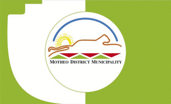
 Image by Valentin Poposki, 19 Dec 2021
See also:
Bloemfontein now also forms part of the Mangaung Metropolitan Municipality.
Bruce Berry, 02 Jan 2022
The flag of the municipality contained the municipal logo in the centre of a white disc in the centre of the flag on a green field. On the hoist half of the field contains a white curve and steps.
The logo was designed to incorporate both the European and African cultures prevalent in the local community to create sense of unity. The symbolism of the colours and shapes was outlined in its Corporate Identity Manual (2008) as follows:
Blue represents communication and unity, natural water supply and the African
sky;
Red represents the Asian Community, the struggles of the past (race, religion
and sex) and the rose. Bloemfontein is known as the "City of Roses", thus
the rose is one of the most well-known commodities in the area;
Green represents culture and agriculture;
Black represents Industry and the African community;
Yellow represents life and the sun; and
Orange represents the leopard - the local provincial symbol.
The arch symbolises communication and the Circle of Life while the
alternating red and green triangles symbolise movement into the future,
wildlife, strength and pride. The triangles themselves also represent the three
local municipalities (Mangaung, Mantsopa and Naledi) which formed the Motheo
District.
Valentin Poposki, 19 Dec 2021