 klaus-michael schneider
Keywords: education |
Links: FOTW homepage | search | disclaimer and copyright | write us | mirrors

Last modified: 2021-05-22 by  klaus-michael schneider
Keywords: education |
Links: FOTW homepage |
search |
disclaimer and copyright |
write us |
mirrors
![[Flag of Colombia]](../images/c/co.gif) (2:3)
(2:3)  image by Željko Heimer, 20 May 2001
See also:
Other Institutions:
 image by Ivan Sache, 20 October 2014
Institución Educativa La Independencia was established on 26 November 2002 in
Medellín (Antioquia Department), as the merger of Liceo La Independencia (est.
on 5 March 1996) and Escuela Refugio del Niño.
The flag of the institute is horizontally divided green-white-red. Green is a
symbol of hope, faith, friendship, commitment, and respect. White is a symbol of
peace, purity, integrity, obedience, and firmness. Red is a symbol of love,
empowerment, compromise, and responsibility.
Source:
http://www.ieindependencia.edu.co/index2.php?id=8257&idmenutipo=1462&tag= -
Institute's website
Ivan Sache, 20 October 2014
"Collegio La Inmaculada" was founded in 1967 by
Mother María Pilar Izquierdo Albero in Chia.
The flag of the institute, as shown on a photo available on the institute's
website, is horizontally divided white-light blue with the
emblem of the institute in the middle. White and light blue are
the traditional Marian colours.
The emblem of the institute is an open book placed behind a
torch. The left side of the book is white with the name of the
institute in dark blue; the right side of the book is dark blue
(much darker than the flag field) with a white flower surmounted
by the motto of the institute, in dark blue letters, "Amor /
Ciencia / Virtud" (Love / Science / Virtue).
Ivan Sache, 15 December 2008
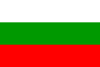 image by Ivan Sache, 16 September 2014
Institución Educativa La Inmaculada Concepción is located in the Santo Tomás
borough, part of the municipality of Guarne (Antioquia Department).
The flag of the institute, designed by Nicolás Cano, is horizontally divided
white-green-red. White is a symbol of force and transparency. Red is a symbol of
belonging to Colombia, whose heroes shed their blood for liberty. Green is a
symbol of belonging to Antioquia.
Source:
http://www.inedinco.edu.co/index2.php?id=8968&idmenutipo=1528&tag= -
Institute's website
Ivan Sache, 16 September 2014
I wonder if this flag you report from this school in
Guarne is a branch or is the same as the flag of the
Colegio La Inmaculada located in
Medellín.
Esteban Rivera, 17 September 2014
 image by Ivan Sache, 10 September 2014
Institución Educativa La Libertad is located in the La Libertad sector of
Villatina borough, part of the municipality of Medellín (Antioquia Department).
Colegio La Libertad was established on 15 October 1996 by Resolution No. 936, as
the merger of Escuela La Libertad (est. on 13 November 1986) and Escuela Urbana
Integrada Comunitaria la Paz (est. by Municipal Decree No. 1,258 of 16 December
1993). Institución Educativa La Libertad was eventually established by
Resolution No. 16,258 of 27 November 2002.
Source:
http://www.ielalibertad.edu.co/ - Institute's website
The flag of the institute is horizontally divided blue-wine red, with the
institute's emblem in the middle. Blue is a symbol of peace and tenderness. Wine
red represents the relation with earth and arts. The emblem is bordered by a
yellow ring, symbolizing the spiral growth of the ascending human being,
inscribed with the institute's name. Inside is placed an inverted ogival rib,
which represents the divine trinity that raises us towards knowledge. The ogival
rib is charged with mountains, representing the difficulty of the ascension that
requires much tenacity, force, work, compromise and love. It is also charged
with a flying dove, a symbol of spirituality and peace.
Source:
http://www.ielalibertad.edu.co/index2.php?id=336&idmenutipo=112&tag=col -
Institute's website
Ivan Sache, 10 September 2014
 image by Ivan Sache, 5 February 2009
This College was founded in 1915. Its flag is horizontally
divided white-red.
Source: <www.voluntad.com.co>
(defunct), located by Dov Gutterman.
Ivan Sache, 4 January 2004
"Colegio La Merced" , located at Bucaramanga,
Department of Santander, is ran by the Tertiary Capuchin Sisters
of the Holy Family (known in the Hispanic world as
"Amigonianas"). The congregation was founded on 27
April 1885 by Luis José María Amigó y Ferrer (1854-1934),
appointed Bishop of Segorbe (Spain) in 1913, and also the founder
of the Tertiary Capuchin Priests and Brothers of Our Lady of
Sorrows ("Amigonianos") on 12 April 1889. See: <bishopamigo.org>.
The flag of the institute, according to a photo and the
description available on the website of
the institute, is horizontally divided white-red.
White symbolizes purity and peace.
Red symbolizes love.
Ivan Sache, 5 February 2009
 image by Ivan Sache,
6 July 2014
Institución Educativa Distrital Colegio La Merced was established in 1974 in
Bogotá.
The flag of the institute is horizontally divided white-blue with
a thin red horizontal stripe in the middle.
http://colegiolamerced.edu.co/simbolos.html - Institute's website
Ivan Sache, 6 July 2014
 image by Ivan Sache, 7 February 2009
"Escuela Normal Superior La Merced" was founded on 1
February 1913 in Yarumal, Department of Antioquia, by the
Tertiary Capuchin Sisters of the Holy Family (known in the
Hispanic world as "Amigonianas"). The congregation was
founded on 27 April 1885 by Luis José María Amigó y Ferrer
(1854-1934), appointed Bishop of Segorbe (Spain) in 1913, and
also the founder of the Tertiary Capuchin Priests and Brothers of
Our Lady of Sorrows ("Amigonianos") on 12 April 1889.
The third house of the congregation in Colombia was set up in
Yaruma in 1912. See: <bishopamigo.org>.
The flag of the institute, as shown graphically and described on
the website
of the institute, is horizontally divided white-blue.
White represents purity, integrity, obedience and victory.
Blue represents justice, heavens, truth, charity, inner beauty
and reward.
Ivan Sache, 7 February 2009
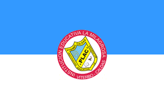 image by Ivan Sache, 14 March 2017
Institución Educativa La Milagrosa was established in Viterbo, Caldas
Department, by the Sisters of Charity of Saint Vincent De Paul, a congregation
established in France in 1633. The institute is made of Colegio La Milagrosa and
Escuela Nuestra Seńora de Fatima.
The institute is named "The Miraculous", as
a tribute to the patron saint of the founding congregation.
The symbols
of the institute are prescribed in Article 7 of the institute's Constitution,
adopted on 9 October 2014 by Resolution No. 22, as follows.
The flag is
horizontally divided celestial blue-white, with the institute's coat of arms,
tilted to the upper hoist and inscribed on a white disk surrounded by a red
border inscribed with the institute's name and place in white letters. Celestial
blue, the colour of the cloak of the blessed Virgin, is a symbol of serenity,
while white is a symbol of peace.
The coat of arms is divided celestial
blue-white (like the flag) by a yellow bend sinister inscribed with "PLAC" in
black letters. "PLAC" means "Perseverencia" (Perseverance), "Libertad"
(Liberty), "Amor" (Love), and "Compromiso" (Commitment) [these are the
"institutional values", as described in Article 5 of the Constitution]. The blue
field is charged with letter "M3, for Mary, a cross, for
Jesus, and 12
stars, for the apostles, all yellow. The white field is charged with an open
book, as a symbol of knowledge and training, and an oil lamp, as a symbol of the
light that illuminates spiritual life. The shield has a yellow border inscribed
with the institute's name and place in black letters.
http://ielamiviterbo.blogspot.fr/p/manual-de-convivencia-2015.html -
Institute's Constitution
Ivan Sache, 14 March 2017
 image by Ivan Sache, 30 July 2014
Liceo Campestre La Misión was established on 5 July 1983 in Cali (Valle
Department) by Luis Carlos Rengifo and Nidia Giraldo, as Jardín Infantil Marco
Antonio. Renamed Colegio Marco Antonio in 1985, the institute adopted its
current name in 1994.
The flag of the institute is horizontally divided red-white-blue with the
institute's emblem in the middle.
Source:
http://www.lcm.edu.co/web/about/institucional/ - Institute's website
Ivan Sache, 30 July 2014
 image by Ivan Sache, 31 October 2014
Escuela Normal Superior de La Mojana was established in Majagual (Sucre
Department) in 1985, as Escuela Normal Piloto Departamental de la Mojana.
Classes started on 2 February 1992. La Mojana (more or less, the Wet Area) is a
large territory encompassing 28 municipalities in the Bolívar, Antioquia, Sucre,
and Córdoba Departments. Watered by rivers Cauca, San Jorge, and Loba, the area
is threatened by catastrophic winter floods (see
http://www.eltiempo.com/archivo/documento/CMS-12865614).
The flag of the institute, adopted in 2008, is presented in the Teacher's
Induction Guidebook as horizontally divided blue-yellow-green. Blue represents
the heavens reflected in wet areas, canals, and rivers. Yellow represents the
agricultural resources and prosperity, mainly provided by rice cultivation.
Green represents the soil's fertility. Green is also a tribute to Sucre
Department, while green and yellow are a tribute to the municipality of Majagual.
Source:
http://www.iensdelamojana.majagual-sucre.gov.co/apc-aa-files/34653937666566363365333562386165/MANUAL_DE_INDUCCION_NORMAL_MOJANA.pdf
- Institute's website
Ivan Sache, 31 October 2014
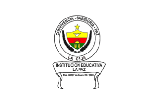 image by Ivan Sache, 13 May 2021
Institución Educativa La Paz was established in 1977 as Concentración de
Quintos by Antonio Arbelaez Zuluaga, coordinator of Unidad Educativa de
la Ceja. The school was renamed to Escuela Urbana Integrada la Paz in
1987, Concentración Educativa La Paz in 1996, and Colegio La Paz in 1997.
Institución Educativa La Paz was established by Resolution No. 527
issued on 23 January 2003 as the merger of Colegio La Paz and Centro
Integral Para Jóvenes y Adultos.
The flag of IE La Paz is white, a symbol of peace and purity, with the
school's coat of arms in the center.
On the coat of arms, the dove is a symbol of peace and love. It is a
gift of science and knowledge, important and sacred since it represents
the Holy Spirit.
The sun represents success, glee, life, pleasure, happiness, glory,
luminosity, power and force.
The hands are a symbol of love, peace and work. They also represent
dedication to God and to the others, pardon and liberty.
The spikes represent the students' progressive growth, symbolizing hard
work and hope to harvest good fruit.
Sources: institute website and institute symbols website
Ivan Sache, 13 May 2021
 image by Ivan Sache, 25 November 2014
Institución Educativa La Pintada was established in the urban area of
La Pintada (Antioquia Department) as the merger of Liceo La Pintada,
Escuela Margarita Correa and Escuela Luis Felipe Fernández.
The school was originally established by Municipal Agreement No. 3 of
30 December 1970, while La Pintada was still a borough of Santa
Bárbara, as Escuela Tulio Villegas Jaramillo, a secondary seat of
Liceo Tomas Oziel Eastman. IDEM La Pintada was established by
Departmental Decree No. 869 of 2 May 1978 and made a secondary seat of
Colegio Damasco in 1986. Liceo La Pintada was eventually established
by Resolution No. 2,664 of 8 July 1996.
The flag of the institute is horizontally divided white-blue.
White, a symbol of peace, represents transparency.
Blue represents the immensity of the heavens and waters, and the
preservation of principles, values, honour and generosity.
Source:
http://www.ielapintada.edu.co/index.php/quienes-somos/simbolos-institucionales - Institute's website
Ivan Sache, 25 November 2014
 image by Ivan Sache, 25 July 2014
Institución Educativa La Plazuela is located in the village of La Plazuela,
part of the municipality of Zapatoca (Santander Department). The institute is
managed by the Zapatoca municipal administration.
The flag of the
institute is horizontally divided blue-white-green with the institute's coat of
arms in the middle. Blue represents the local water resources. White represents
the moral and spiritual peace of the people of Zapatoca. Green represents the
local natural resources: woods, crops and pastures, which supply the community
with fresh air, food and protection.
The emblem of the institute is a
shield surrounded dexter by cocoa pods and sinister by coffee flowers,
representing the local agricultural diversity. The shield is quartered,
featuring four elements that represent integral education:
- a book
(cognition);
- the Olympic rings (sports, recreation and integration);
- a
hammer (work);
- a red cross (religion and health).
The scroll placed
above the shield is inscribed with the institute's motto, "CIENCIA PAZ PROGRESO"
(Science Peace Progress).
http://celaplazuela.wordpress.com/about/ - Institute's website
Ivan Sache, 25 July 2014
"Colegio Nacionalizado La Presentación" is located
at Duitama, Department of Boyacá.
Photos available on the website
of the institute show two different versions of the flag.
On photos
taken during the Colours ceremony 2008, the flag is horizontally
divided blue-white with the emblem of the institute in the
middle.
On photos
taken during the "Intercolegiados" sports event, 17
July 2008, the flag is horizontally divided white-blue with the
emblem of the institute in the middle.
To make the things even simplier, the flag used during the Colours
ceremony at the Higueras section of the institute seems to be
horizontally divided white-blue, without the emblem (but the
emblem on the other flags is quite small, therefore it may have
remained hidden in the flag folds).
The emblem of the institute shows, on a white disk bordered by a
blue ring with the name of the institute in white capital
letters, a blue disk outlined in yellow, charged with a yellow
bee in the middle and ten yellow disks on the border, and
surmonted by a yellow cross.
Ivan Sache, 14 January 2004
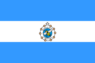 image by Ivan Sache, 08 October 2014
Instituto Técnico Educativo La Presentación is located in San Luis de
Palenque (Casanare department).
The flag of the institute is horizontally divided blue-white-blue with the
institute's emblem in the middle.
Source:
http://danzasanluisdepalenque.blogspot.fr/2012/09/festivaldanzafolcloricacolombianaslp.html
The emblem of the institute features a bee flying on a white disk surrounded by
a white ring inscribed with "INSTITUTO TECNICO" (top) / "LA PRESENTACION"
(bottom) in black letters, bordered with ten yellow disks and ending in its
upper part as a cross.
Source:
http://2feriadelainnovacion.blogspot.fr/
Ivan Sache, 08 October 2014