
Last modified: 2017-12-09 by antónio martins
Keywords: esperanto | star: 5 points (green) | canton: star | duchois | michaux | sargeant | rjabinis (c.) | deullin (p.) | jonson (b. g.) | beaufront (louis de) | e | jubilea simbolo | ee | verda stelo | contest |
Links: FOTW homepage |
search |
disclaimer and copyright |
write us |
mirrors
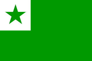
image by António Martins, 16 Mar 2004
See also:
External links:
Esperanto accounts for more than 99% of all published
material on interlinguistics, and probbably much more than
99% of the speakers of all constructed languages.
António Martins, 04 Jun 1999
Esperanto is identified by the green star, and that they have a flag,
which could be blazoned «Vert, on a canton argent a star vert»
(a green flag with a green star in a white canton). Green is certainly the
colour of Esperanto.
Michael Everson, 29 Aug 2010
The Esperanto flag: green 2:3, white 1:1 canton with
0,35 radius green 5 pointed regular star pointing upwards
centered on it.
António Martins, 04 Jun 1999
Esperanto organizations and individual esperantists use this
flag as a general symbol of their language; variants defaced with
organization names and slogans, written on the bottom half of the
flag, are usual.
Some organizations, especially those whose logo or emblem is based
on the green star, put it on the canton of an otherwise unmodified
esperanto flag (see particular variants).
António Martins, 14 May 2004
According to [rod97], both a star and the green color were associated to Esperanto quite early, following a call for it from B. G. Jonson, a Swedish Esperantist. Louis de Beaufront (who later become adept of Ido) proposed and initiated the usage of publishing books written in Esperanto with their covers green and with a star on it. The idea caught on and soon the green color and the star symbol were all over in Esperanto written books and periodicals. However nothing was fixed for the exact design of the star neither for its color — it was often golden, on the green background.
In 1893, were used the first lapel pins with a green star on a white background, by C. Rjabinis and P. Deullin, in a design used until today. The meaning of this symbol was, as usual, coined a posteriori — said to stand for the hope (green) of the five continents untited (5-pointed star) in common understanding and peace (white color)…
António Martins, 04 Jun 1999
In the website of the International Esperanto Museum in
Wein, Austrian National Archives, there’s
a facsimile
of a poster inviting to the 2nd World Esperanto Congress, held in
Geneva in 1906. It shows the esperanto flag as we
know it. This is interesting because the design had been accepted
only one year before,
at the 1st World Esperanto Congress (1905, Boulogne-sur-Mer, FR).
António Martins, 24 Mar 2005
In Panorama in interlingua 2/1991: p.16 “Ab le
archivo” [ial91a] black and white
symbols of constructed languages from «our archive»
(probably the image sources as for [rod97]?),
which I quote: (dates are language publishing, not symbol creation):
«Esperanto, 1887»: large outlined star enclosing "esperanto" in arched
capitals above smaller (filled) star; both stars are regular starry pentagons
(alternating points colinear) pojnting up. Not really the emblem
(which never changed), but a quite tacky offshoot variant.
António Martins, 13 Aug 2007
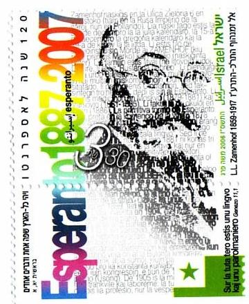
The Israeli Postal Authority has issued a
stamp in honor of the 120th anniversary of Esperanto (1887-2007). At the
bottom of the
stamp — actually on the piece attached to the stamp, I
don’t know the technical term — is the flag of Esperanto, but in
the “large canton” version. The
accompanying
booklet gives the post-facto explanation [about five continents].
Nathan Lamm, 02 Jan 2007
I’m quite sure that the Israeli stamp now issued is intended to represent
the current esperanto flag, perhaps with an oversized canton
and surely with the bottom of the flag “bleeding” out from the
paper.
António Martins, 03 Jan 2007
Some organizations, especially those whose logo or emblem is based
on the green star, put it on the canton of an otherwise unmodified
esperanto flag.
António Martins, 14 May 2004
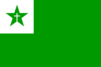
image by António Martins, 14 May 2004
Christian esperantists of most denominations use Esperanto’s
star defaced with a cross outline in pins and emblems. Some flags show this
on the usual canton, with or without lettering in the lower
fly.
António Martins, 14 May 2004
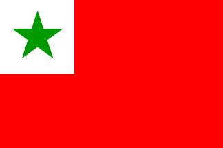
image by António Martins, 14 May 2004
An exception to this seems to be left wing
esperantists, on record for seldom usage of a regular
esperanto flag with green star on the white canton of a
red flag, instead of green.
This may stem from the green star fimbriated red that makes the emblem
of SAT (Sennacieca Asocio Tutmonda).
António Martins, 14 May 2004

image by António Martins, 16 Mar 2004
Perhaps because the star is a very “plain” logo, easy to confuse especially in black-and-white medium, it is quite often to deface the star with a white upper case "E", of obvious meaning. This however is seldom done in flags, perhaps because the complete design (field, canton and star) is less confuseable than an isolated star.
There are however some cases of flags with "E"-stars, some dating back to the earlier days of Esperanto, as the one above, from a photo taken in the II Esperanto World Congress, in Dresden (Germany), 1908.
António Martins, 16 Mar 2004

image by António Martins, 04 Jun 2007
A 1975 article in czech vex. magazine Vexilologie 16 p.
180-181, 184 “70 let vlajky Universala Esperanto Aoscio”
[klj75a], by Jaroslav Klement (available
on line)
reports the flag of Esperanto language, 70 years old by
then. It is termed the organization flag of the Universal
Esperanto Association (which, this being its most representative instance,
is but a slight mistake).
The article shows and describes unusual specs: A 3:5 ratio, against the
official 2:3 of [n9l03]; and canton side
only one third of the height, instead of one half — albeit
tentatively («rovna 1/3 šířky listu»,
my emphasis). The differences to naked eye comparing with the usual design are
too great not to consider this an error.
António Martins, 04 Jun 2007
image by Ivan Sache, 01 Jan 2009
In the a collection of world flags assembled by
Priest Legros shown in the castle of La Palice in Lapalisse, France, the
flag
labelled as of Esperanto has a rectangular canton and the star
tilted.
Olivier Touzeau and Ivan Sache, 01 Jan 2009
Apart from the wrong canton and star tilt, the shade of green is way too
light. I wonder where the Abbey got hold of this variant, it seems
manufactored, there should be more of it around.
António Martins, 01 Sep 2010

image by António Martins, 14 Mar 2008
Still according to [rod97],
the Esperanto flag was approved during the 1.st Esperanto
Universal Congress, in 1905, held at
Boulogne-sur-Mer (France).
Originally the flag of the local Esperanto Club, who organized
the congress, it had a design similar to the one in current use:
The main differences in respect to the current
flag are the proportions — it is described as being 120 cm
wide and with a top hoist canton of 50×50 cm. Since nothing
is said about the height, the image above was made in 9:12,
with a 6:6 canton, which more or less coincides with my
recollection of old photos. (Star in the current 70% ratio.)
António Martins, 04 Jun 1999
A word of caution about this design, in (6+3):(6+6) ratio: It is my
reconstruction based on the description taken from
[rod97], and even if it is accurate, it
must have been replaced by the current version, in
(1+1):(1+2) ratio, very early, for I never saw photographic or other
evidence of any significantly different design used later on.
António Martins, 03 Jan 2007
(exact design uncertain)

image by António Martins, 04 Jun 1999
Rodríguez [rod97] says that
Duchois, Michaux and Sargeant, main organizers of the congress,
considered the adoption of a french tricolor
stripe, but soon rejected it. I can see the motive for the refusal
(a national, not an international symbol), but not for the proposal!
I guess the original club flag lacked this stripe and the image above
shows it in the bottom in short of any better idea (though this
is more a yugoslavian tricolor…)
António Martins, 04 Jun 1999

image by António Martins, 05 Jul 2009
The new jubilee symbol (jubilea simbolo), was chosen in contest by the Universal Esperanto Association while preparing the first centenial of the language, in 1987. Called derogatively by some as the melono (mellon), it was designed by a Brazilian esperantist.
While it was not aimed to replace the green star, this logo grew well outside its original usage scope. Even if today it is half forgotten, it knew a quite wide usage during the 1990’ies, especialy by “modern” Esperantists — while traditionalist ones felt some discontempt towards this new logo, who “menaced” to replace the role of nia kara stelo. Since one of the “behavior” differences between these two groups was the almost complete avoidance of pins, flags and other “eccentric looking” displays by the “modernists” (contrasting with a frequently ridiculous and folkloric ornamentation used by the “traditionalists”, namely in flags), the new symbol was quite seldom used in flags, but some in-betweeners of these two tendences soon adapted the new symbol in the old-style usage, of which the flag design above was one of the main examples. (Note that here I’ve over-simplified the quite complex micro-social situation of the current esperanto-speaking community.)
António Martins, 04 Jun 1999
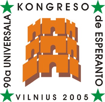
Universal Esperanto Congresses are held in a different city yearly since 1905 (with gaps for both World Wars) and since about the mid-1960ies each congress has a logo, usually including local city symbols along with the an Esperanto symbol, host city name and the words "nn-a Universala Kongreso [de Esperanto]" ("nn" standing for the congress serial number; 2007 will be the 92th, in Yokohama). (Full list here.) These logos however almost never made it to flags, somehow; a single exception was the 90th Universal Esperanto Congress, held in 2005 in Vilnius. There may have been other such flags, but this is the only one I ever found.
Universal Esperanto Congresses are the usualy largest gatherings of Esperanto speakers worldwide (typically 2000-4000 participants) and still give place for formal and solemn events more and more missing in other, smaller Esperanto meetings the year round. Even so, an Esperanto flag is an often sighting in venues of any larger speakers’ meeting.
An interesting “tradition” is to have a large Esperanto flag in the background of the solemn opening and closure of these congresses and their youth equivalents, to wich fly is added each year a patch with every new congress logo (earlier, only city name and year). These usualy much smaller in congresses of the iconoclastic and unformal youth: compare this one (of the 61st Esperanto International Youth Congress, in Zakopane, Poland, 2005: detail of the patches) with this behemot (85th Universal Esperanto Congress in 2000, Tel-Aviv)
Incidently, I found examples of such use also in smaller gatherings: At the 38th Brazilian Esperanto Congress in Belo Horizonte, 2003, and at the 58th Congress of the International Railroad Esperanto Federation, in Shanghai, 2006, both with past congress patches stitched to the fly.
António Martins, 24 Jul 2007

image by António Martins, 24 Jul 2007
A photo (here,
here and
here) shows the
national flag of Lithuania, the flag of
Esperanto and a white flag with the logo of the
90th
Universal Esperanto Congress, held in 2005 in
Vilnius.
António Martins, 24 Jul 2007

image by António Martins, 12 Aug 2008
SAT (Sennacieca Asocio Tutmonda) is a political organization for
left-wing esperantists, encompassing all tendences
except (until recently) communists (marxist-leninist and maoist sorts).
Its usual emblem is a green star fimbriated red.
António Martins, 14 May 2004
This photo
shows a
congress
of SAT in 2004 in Bratislava. It shows the
red Esperanto flag with additional lettering "S.A.T."
in black capitals above the star, where there seems to be extra white space for
it, making me believe that this is specially manufactored to include the
lettering, these therefore not being added later on.
António Martins, 12 Aug 2008
In this vintage
drawing yet another SAT flag, but on an old black-and-white linedraw
image, showing an esperanto flag (maybe red, maybe
green) with the word "SAT" on the star.
António Martins, 12 Aug 2008
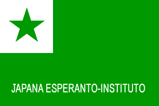
image by António Martins, 25 Oct 2007
Some Esperanto organizations use the flag in variants
defaced with organization names and slogans, written on the bottom half of
the flag. Such is the flag of Japana Esperanto-Instituto (Japanese
Esperanto Institute, a Japanase non-profit NGO),
as seen on the background of a giggling
scene of this summer’s
Children Esperanto
Congress. The exact proportions of this flag may be slightly longer than
the official 2:3.
António Martins, 25 Oct 2007
Anything below this line was not added by the editor of this page.